
OlilO
Artist Brand & Website
Overview
OlilO is the name the painter Olivier Levesque uses for his artwork. We worked together over three rounds, first moodboards, then logo propositions, then the final brand identity, to shape how his art is presented to the public. The identity then carried into a website where he can show and sell his work.
The brief
Create a brand identity for Olivier's art practice that sets how OlilO is perceived, through both concept and visuals, and that can carry into a website.
Research
Keywords
Hard work, attention to detail, family, well-being, focus, emotions, therapy, sharp, well-done, modern art, classy, inviting, monochrome, black and white, grey.
Positioning
OlilO is a palindrome (spelled the same forward and backward) with "lil" centred between two O's. This reflects Olivier's focus on structure, balance and detail. His black and white abstract paintings come from deep concentration and are shaped by emotion. Each piece has personal meaning for him, but they're also made to be open to interpretation. OlilO is about connecting through art and giving viewers space to find their own meaning in the work.
Brand values
- Hard work. Consistency and dedication are key to meaningful work. Olivier puts in the time, even when it's challenging, and treats each project as a commitment to doing his best.
- Attention to detail. Nothing is accidental in his process. From layout to linework, every element is thoughtful, balanced and intentional.
- Family and well-being. Staying connected to family and keeping a healthy routine keep him focused, clear-minded and energised.
Audience personas
- The Aesthetic Seeker (28 to 45). Works in a creative-adjacent field, trusts their taste without being deeply educated in art, and wants a striking piece for a modern, minimal home.
- The Purpose-Driven Achiever (35 to 55). Self-made and driven by excellence. Wants art that reflects intention, originality and effort: a quiet statement piece that marks a milestone.
- The Intentional Spender (30 to 50). Selective and emotionally perceptive, with a thoughtfully designed home. Wants a piece that resonates, that they'll live with for years, from an artist whose process is transparent.
Process
01 · Moodboards
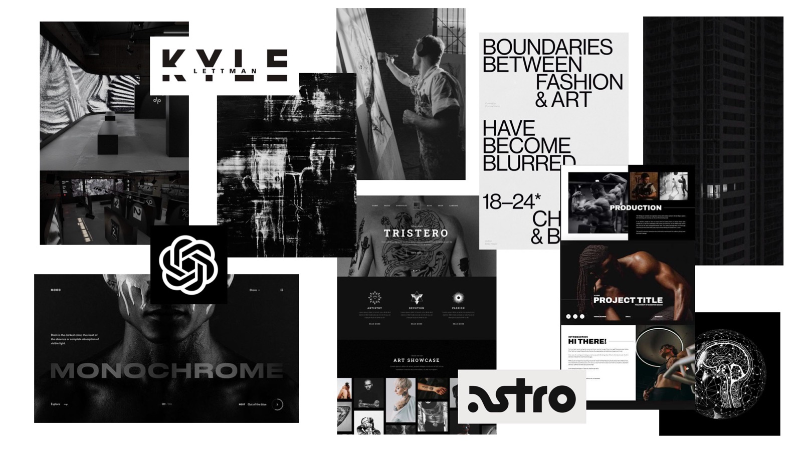
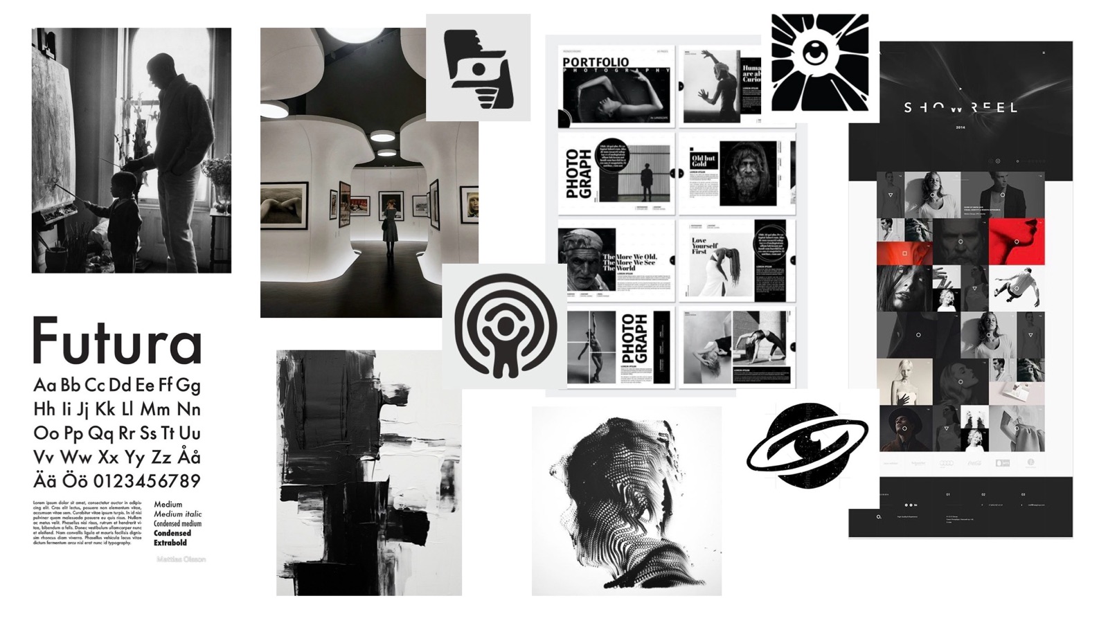
I presented two directions to align on a shared vision for the brand and the website.
- Direction one captures the feeling of being in your own bubble, fully immersed in your focus zone, where painting becomes an emotional release.
- Direction two puts creativity and passion at the core, with family as the value that fuels the work. Brighter tones give it a more welcoming feel.
02 · Logo propositions
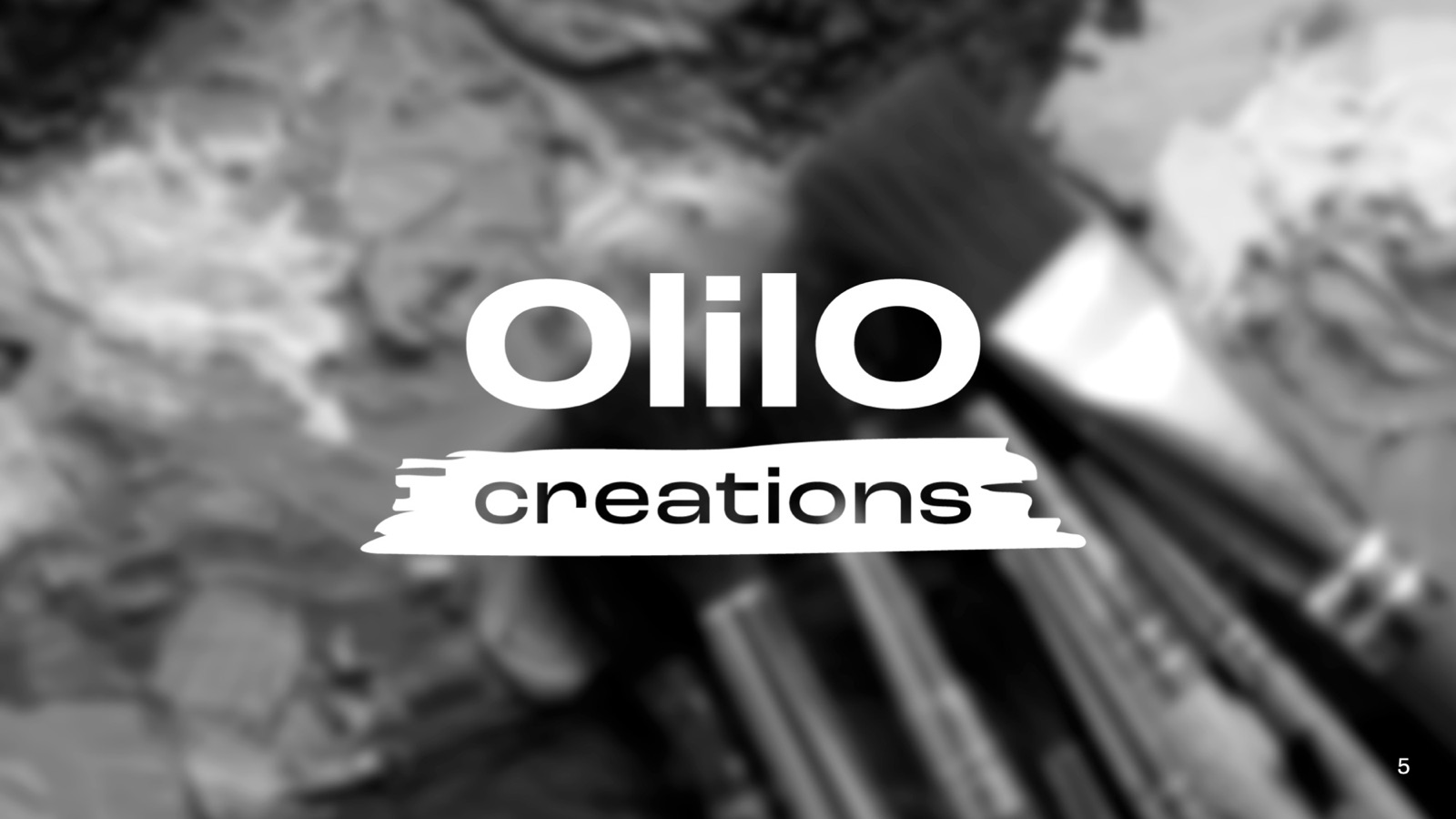
- Bold wordmark with a brush stroke. Capital outer O's enclose a lowercase "lil", emphasising the word "little" held within something greater. A brush stroke under "creations" adds the expressive side.
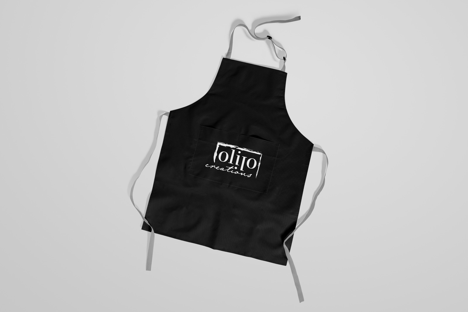
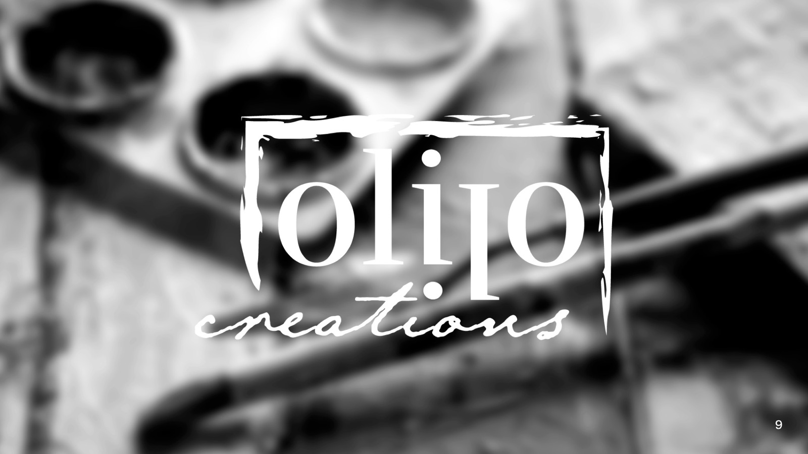
- A framed visual palindrome. A painted border evokes a picture frame and a creative bubble. "olilo" reads the same upside down, and the flipped "i" doubles as the dot of the script "creations".
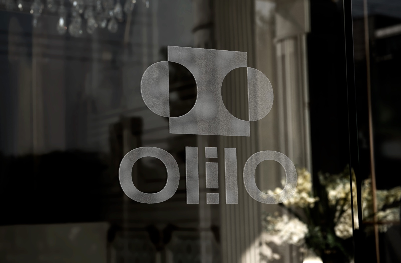
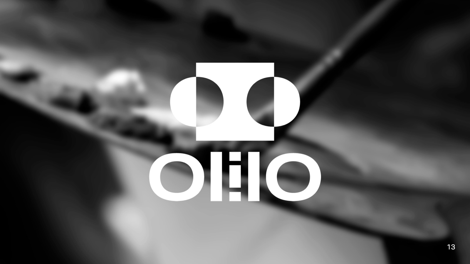
- A flippable wordmark and symbol. The "i" is dotted on both sides so the word looks the same flipped any way. The logomark, a square cut by two circles, suggests a person wearing headphones, immersed in their work.
03 · Brand identity
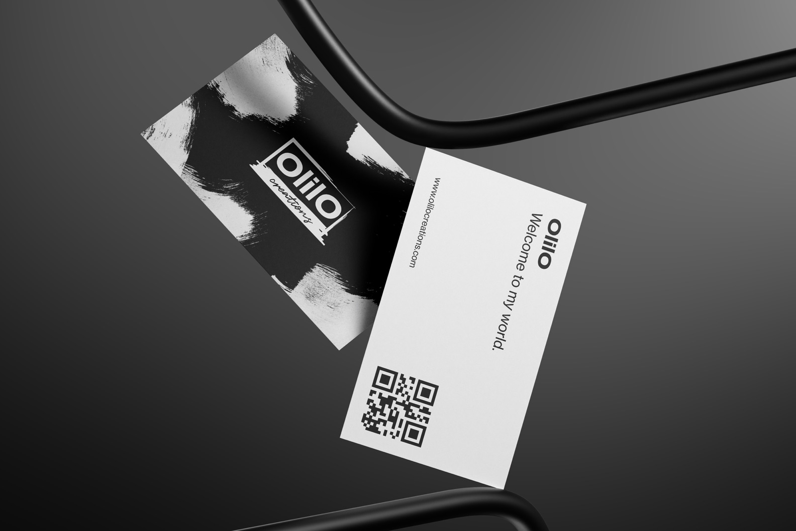
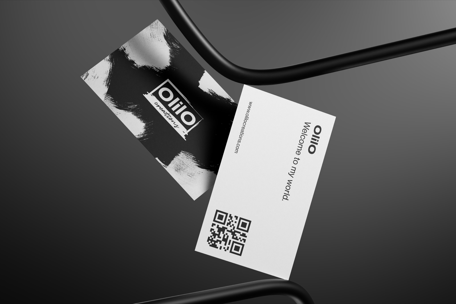
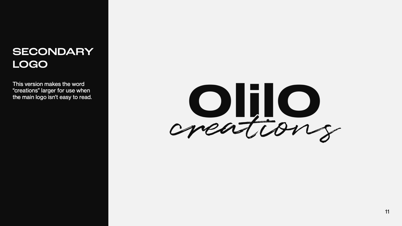
The primary logo sets the bold OlilO wordmark inside a brushed frame with "creations" in script. A secondary version makes "creations" larger, and the wordmark alone works as the logomark when space is tight.
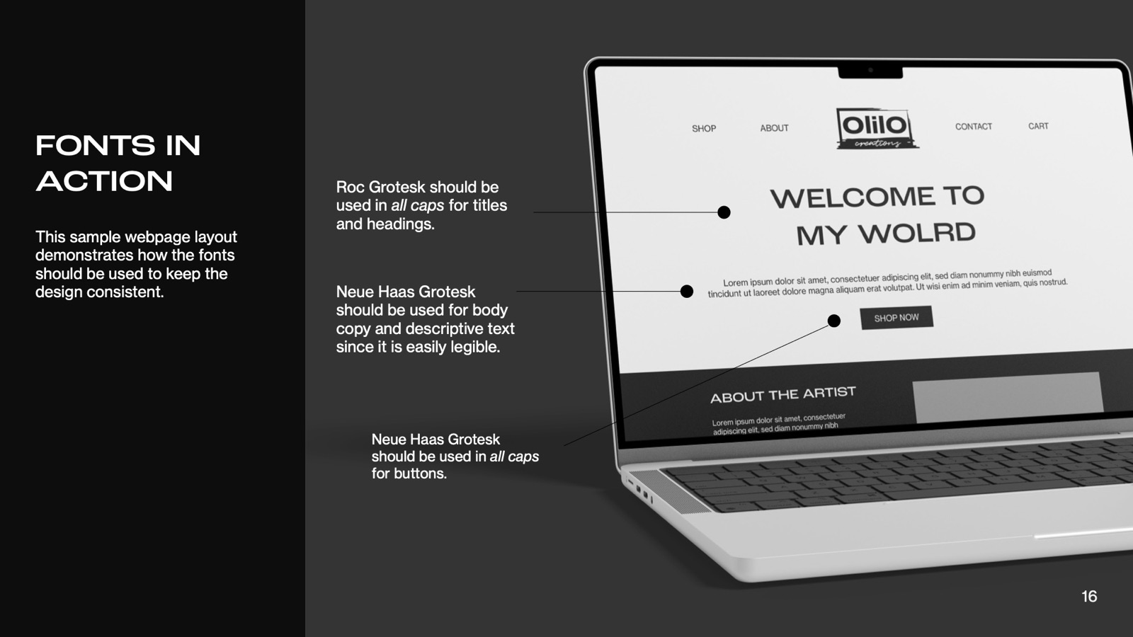
Typography. Roc Grotesk Wide Medium for headings: bold and modern, it reflects the hard work behind each piece and hints at how technology shapes the world. Neue Haas Grotesk Text Pro for body text and buttons: clean and simple, so it stays out of the way of the emotion in the art.
Colour. A monochrome palette, with softened tints instead of pure black and white so it's easier on the eyes and more distinctive.
| Colour | Hex | RGB |
|---|---|---|
| White | #F2F2F2 | 242, 242, 242 |
| Light grey | #939393 | 147, 147, 147 |
| Dark grey | #343434 | 52, 52, 52 |
| Black | #0D0D0D | 13, 13, 13 |
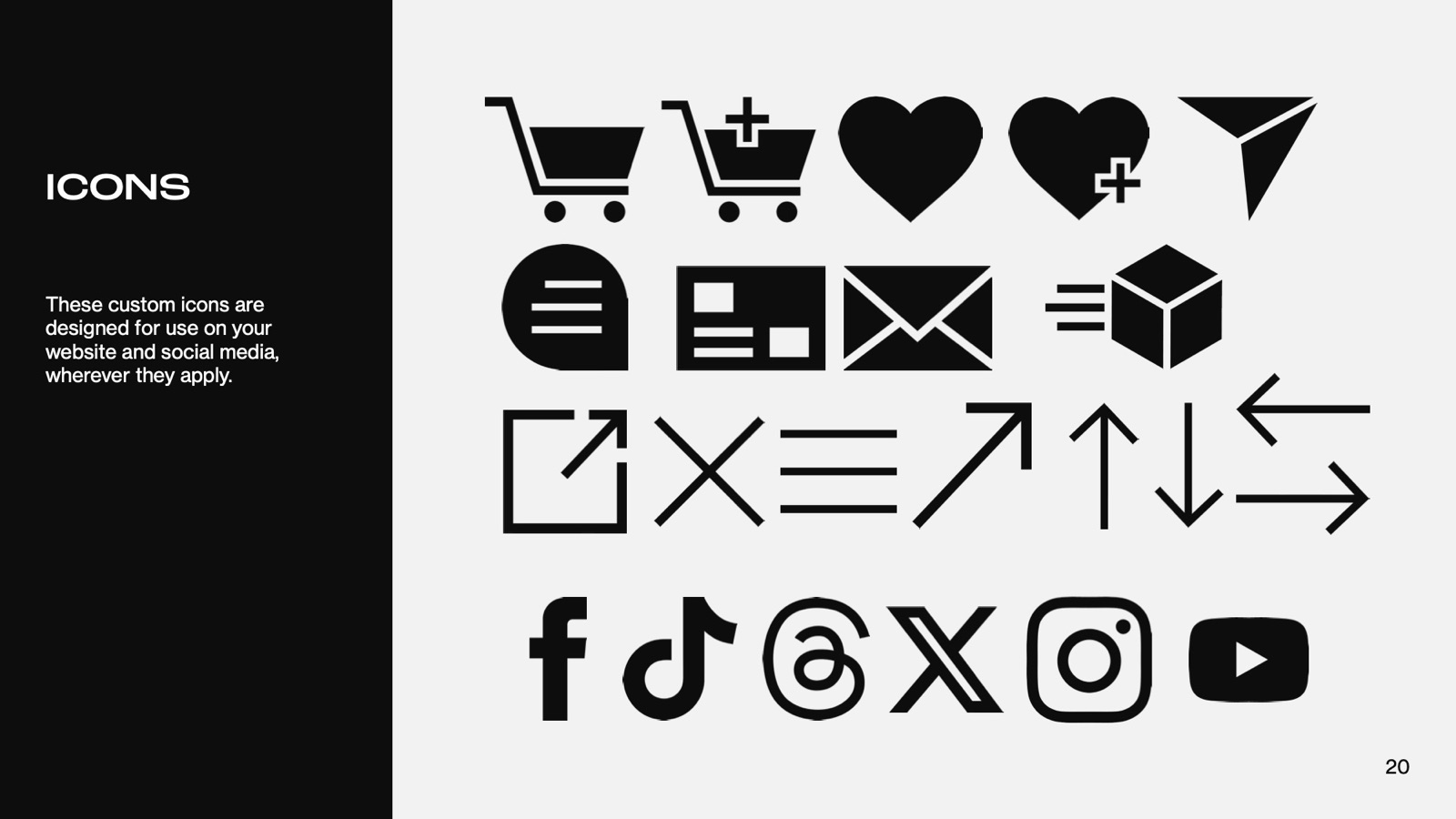
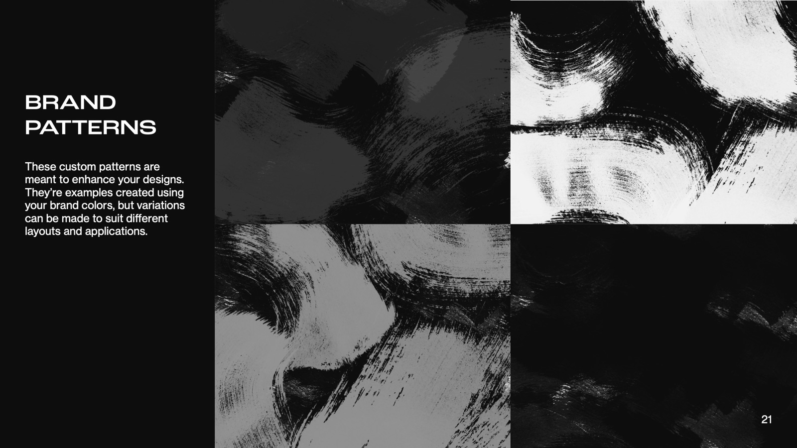
Visual assets. A custom icon set for the website and social media, and brush-texture patterns to build layouts with.
04 · Website
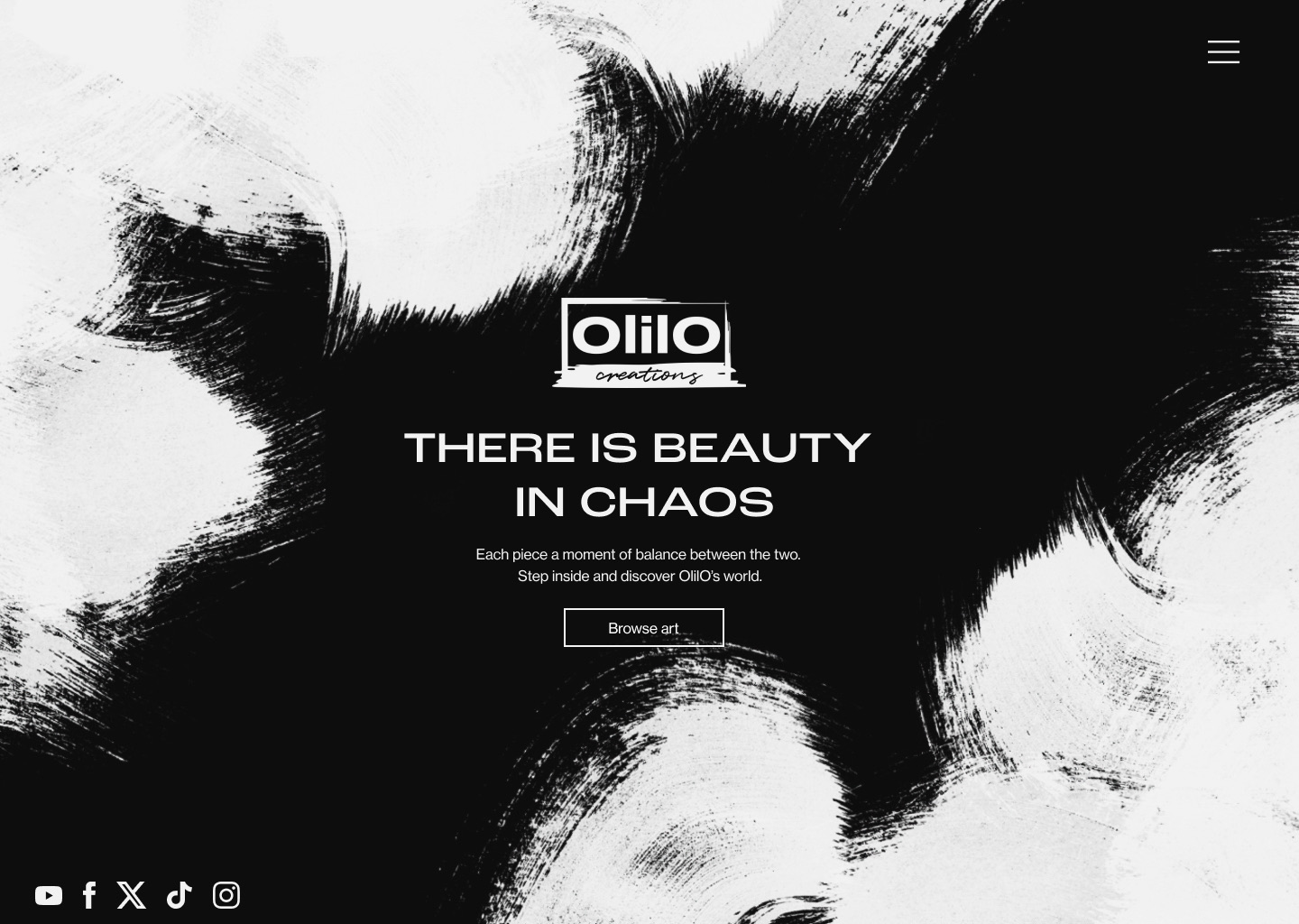
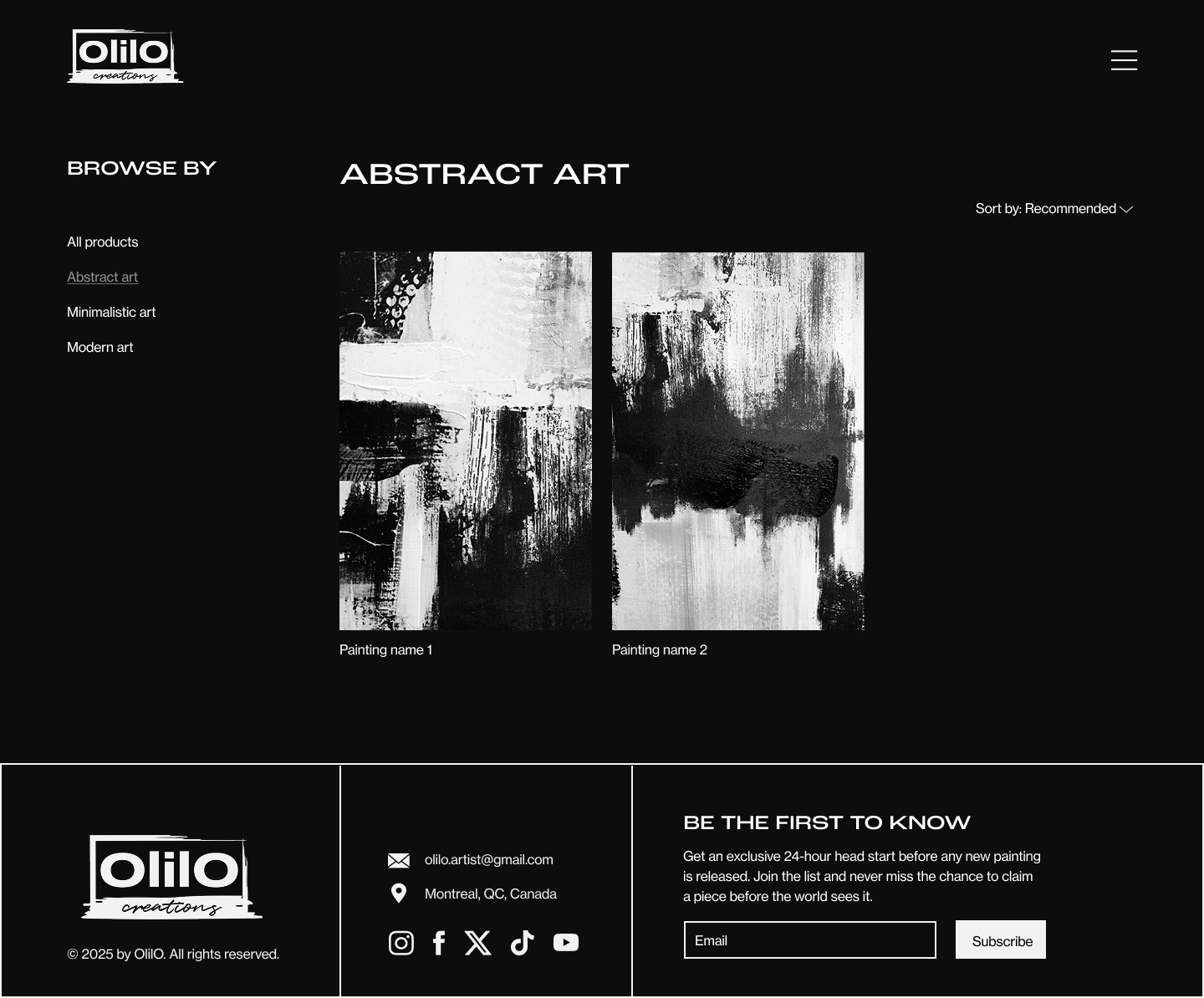
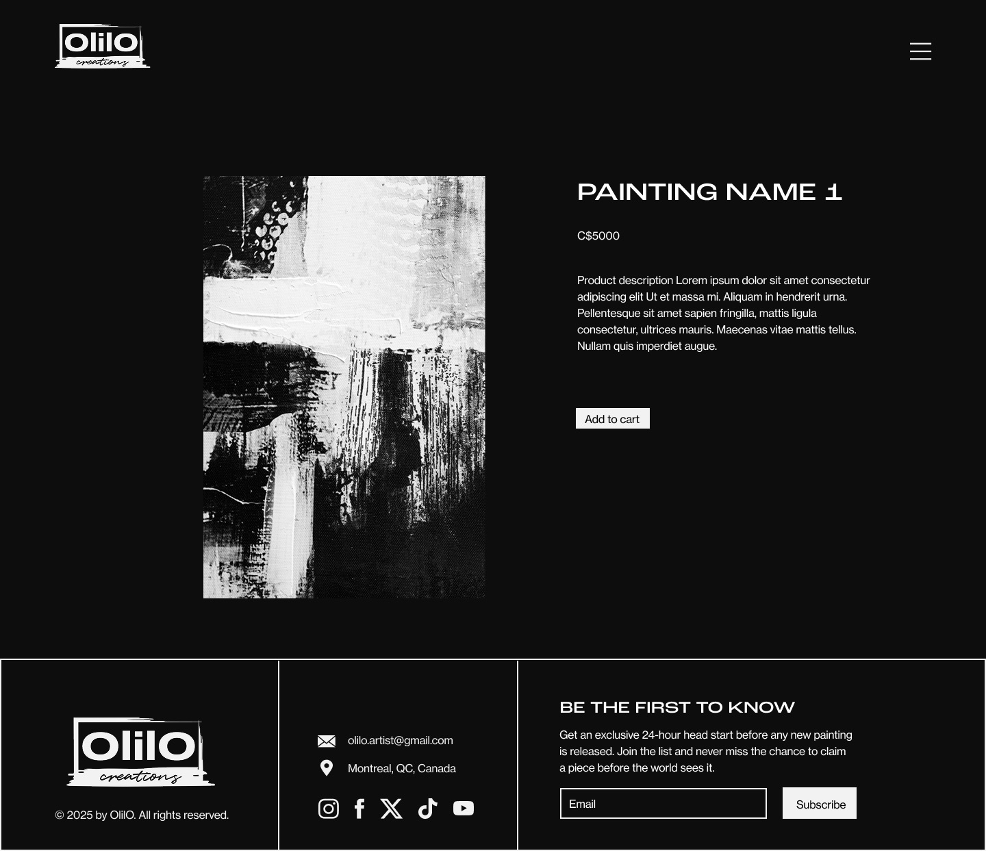
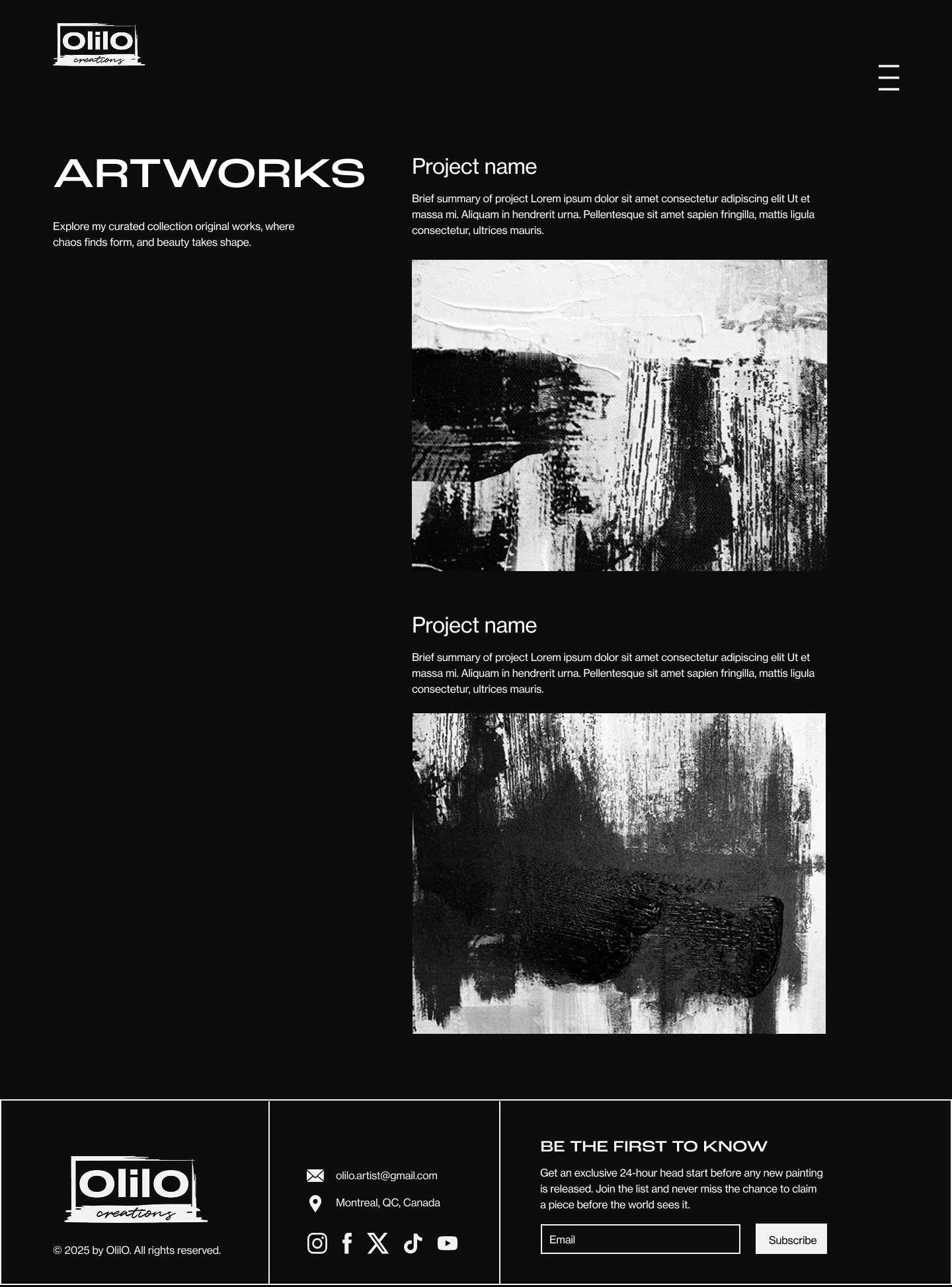
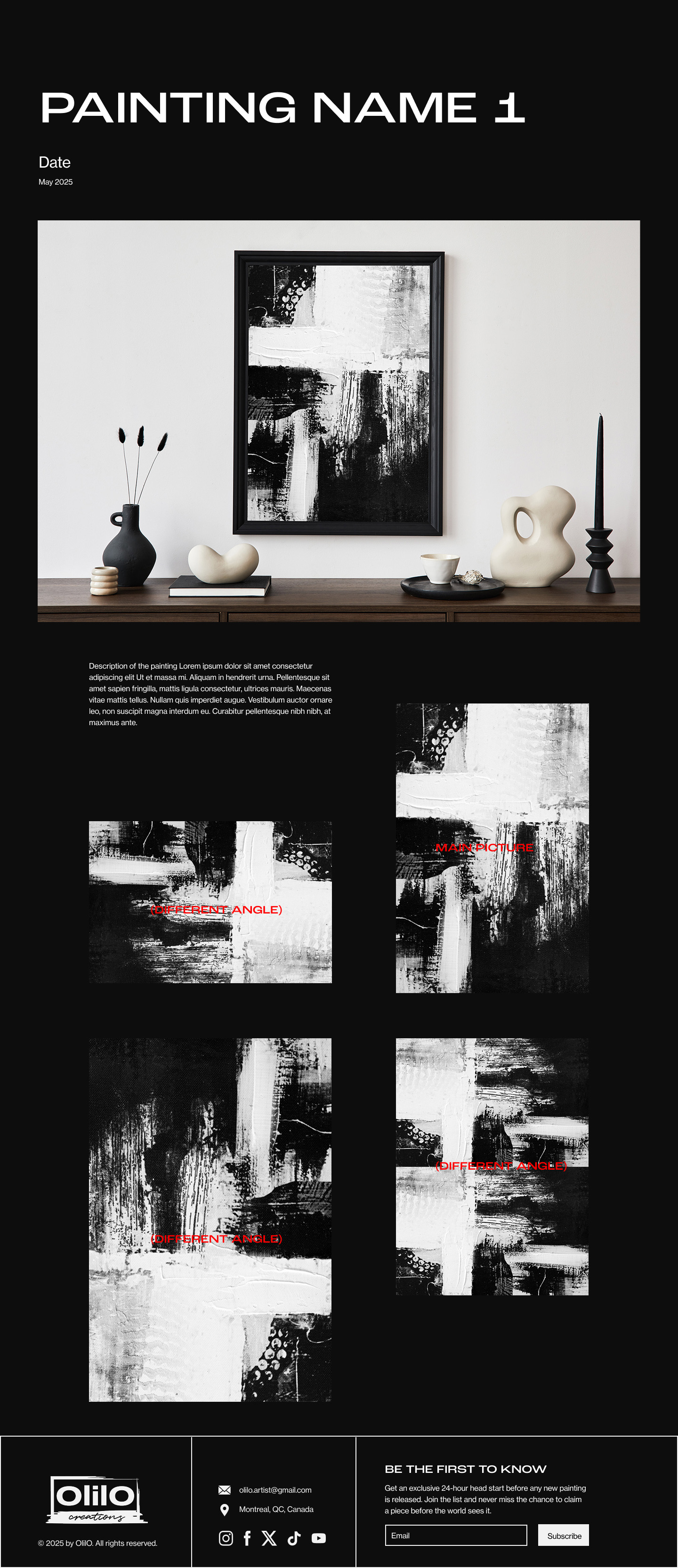
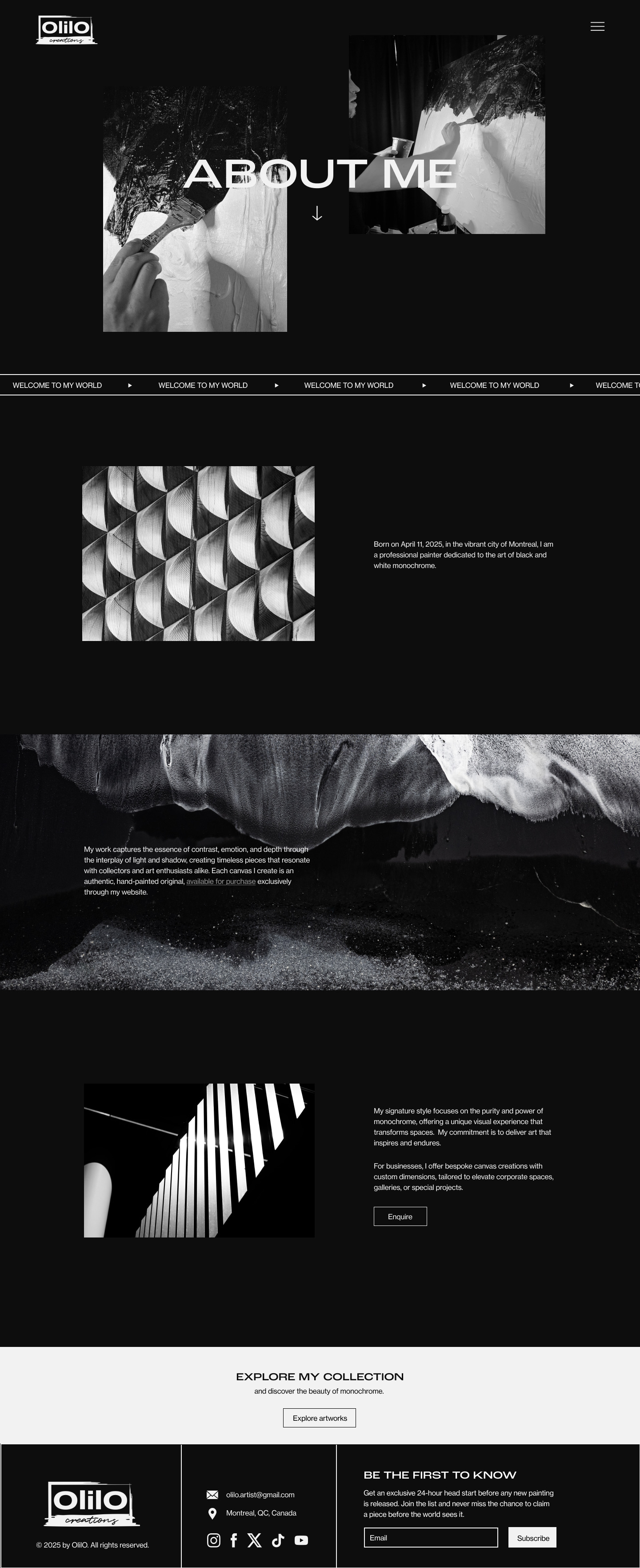
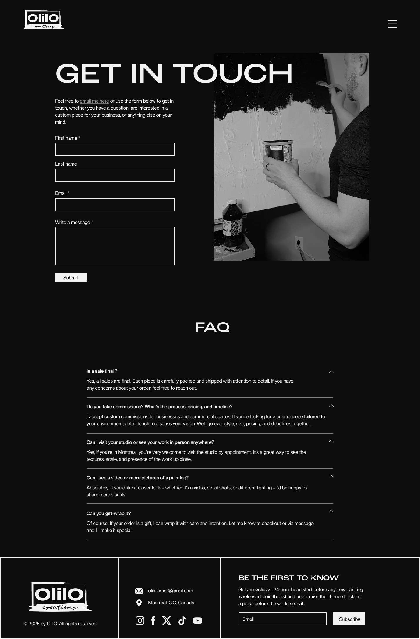
The website brings the identity online. The home page opens on the brush pattern with "There is beauty in chaos" and a single "Browse art" button. Inside, the site stays black and monochrome so the paintings stand out: a shop with a "Browse by" category sidebar, a page for each painting, and portfolio, about and contact pages. Every page ends with a "Be the first to know" footer that invites visitors to join the list for early access to new paintings. Headings are set in Roc Grotesk Wide and body text in Neue Haas Grotesk, as in the brand guide.
Deliverables
- Two moodboard directions
- Three logo propositions, each shown in use
- Brand identity guide: logos, typography, colour, icons and patterns
- Business card and mockups
- Website design: home, shop, product, portfolio, about and contact pages
Final work