
Luméa
Skincare Brand Identity
Overview
Luméa is a skincare brand I created for a self-directed project. I built its identity from positioning and personas through to logos, a visual system and product packaging.
Research
Positioning
Luméa is a skincare brand focused on hydration and renewal. Designed to regenerate and revitalise, each product deeply nourishes the skin, creating a smooth, radiant base that's ready for day or night.
Brand values
- Deep hydration as the foundation of healthy, radiant skin.
- Pure, targeted skincare that puts function first.
- Intentional moments to reconnect and feel good in your skin.
Personas
- Camille, 31. An active urban professional who thrives on a consistent routine and values effective ingredients she can trust.
- Sofia, 22. A university student who wants smoother, less textured skin, and products that hydrate deeply without clogging pores.
- Amina, 26. Embraces her natural beauty, believes simplicity is key, and wants to feel hydrated from the inside out.
Process
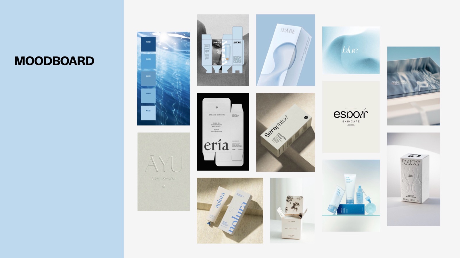
01 · Moodboard
Clean, minimal skincare packaging, soft gradients and water imagery, all in white and shades of blue.
02 · Logos
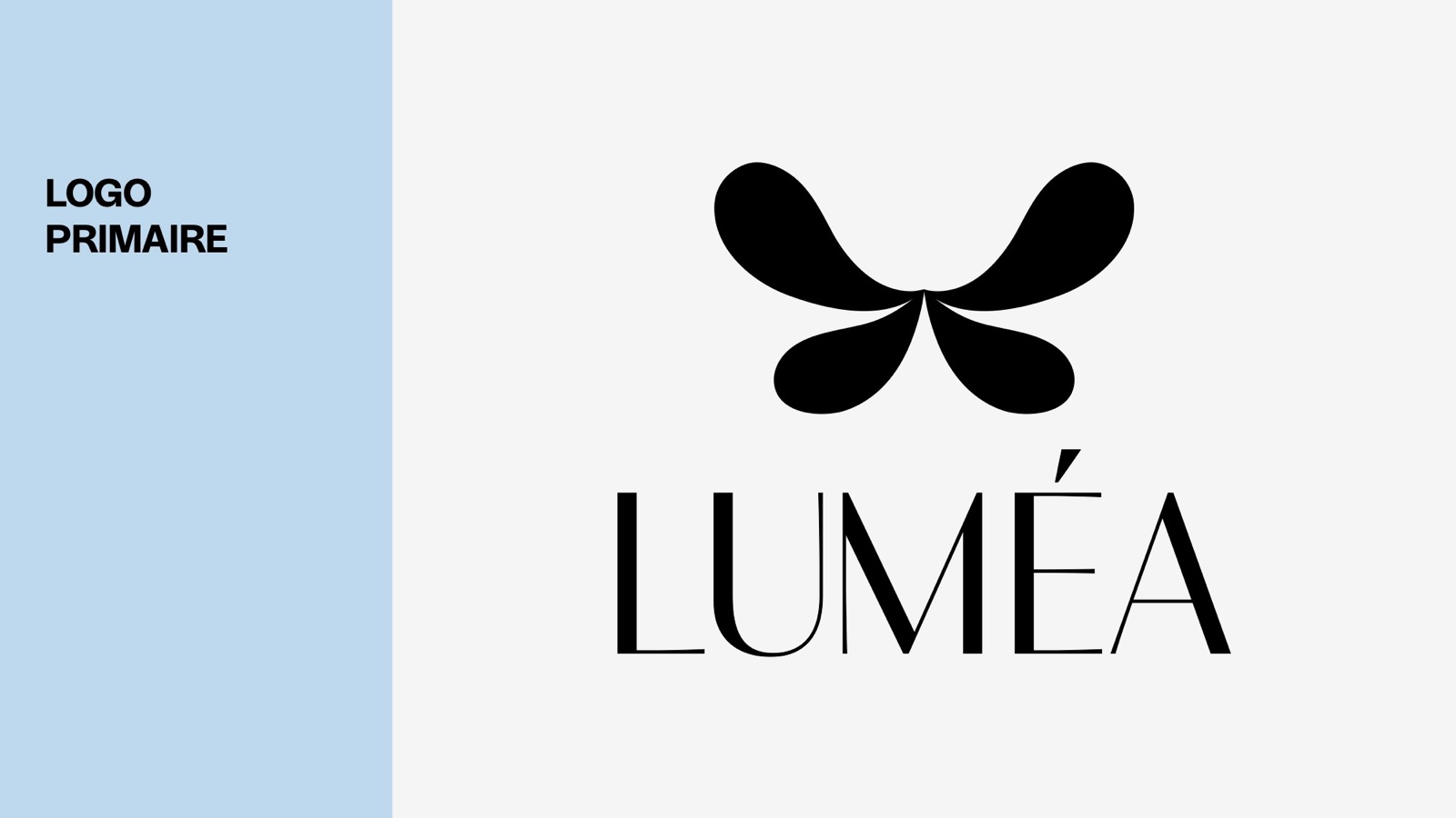
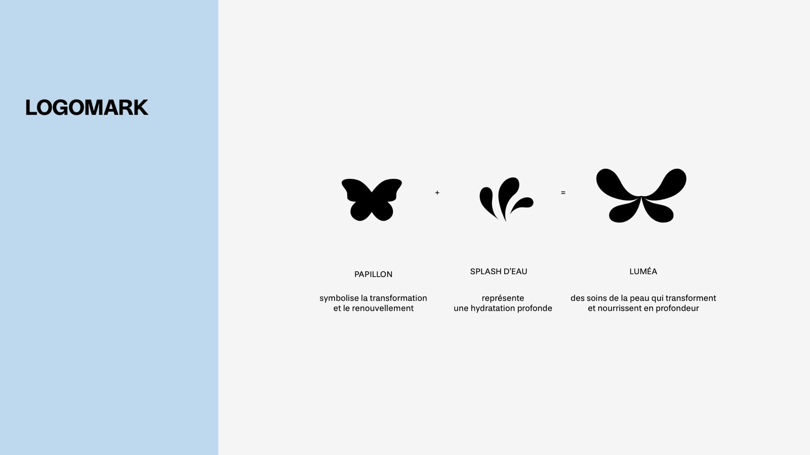
The logomark is a butterfly plus a water splash. The butterfly stands for transformation and renewal, the splash for deep hydration. Together they mean skincare that transforms and nourishes in depth. The primary logo sets the mark above the LUMÉA wordmark.
03 · Visual elements
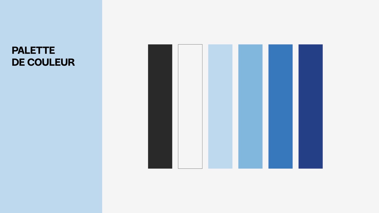
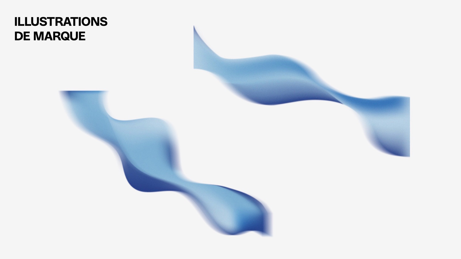
Typography: Stevie Sans Medium in uppercase for headings, Stevie Sans Light for text. Palette: black, white and four blues, from pale sky blue to deep navy. Illustrations: flowing blue ribbons that suggest water and movement.
04 · Packaging
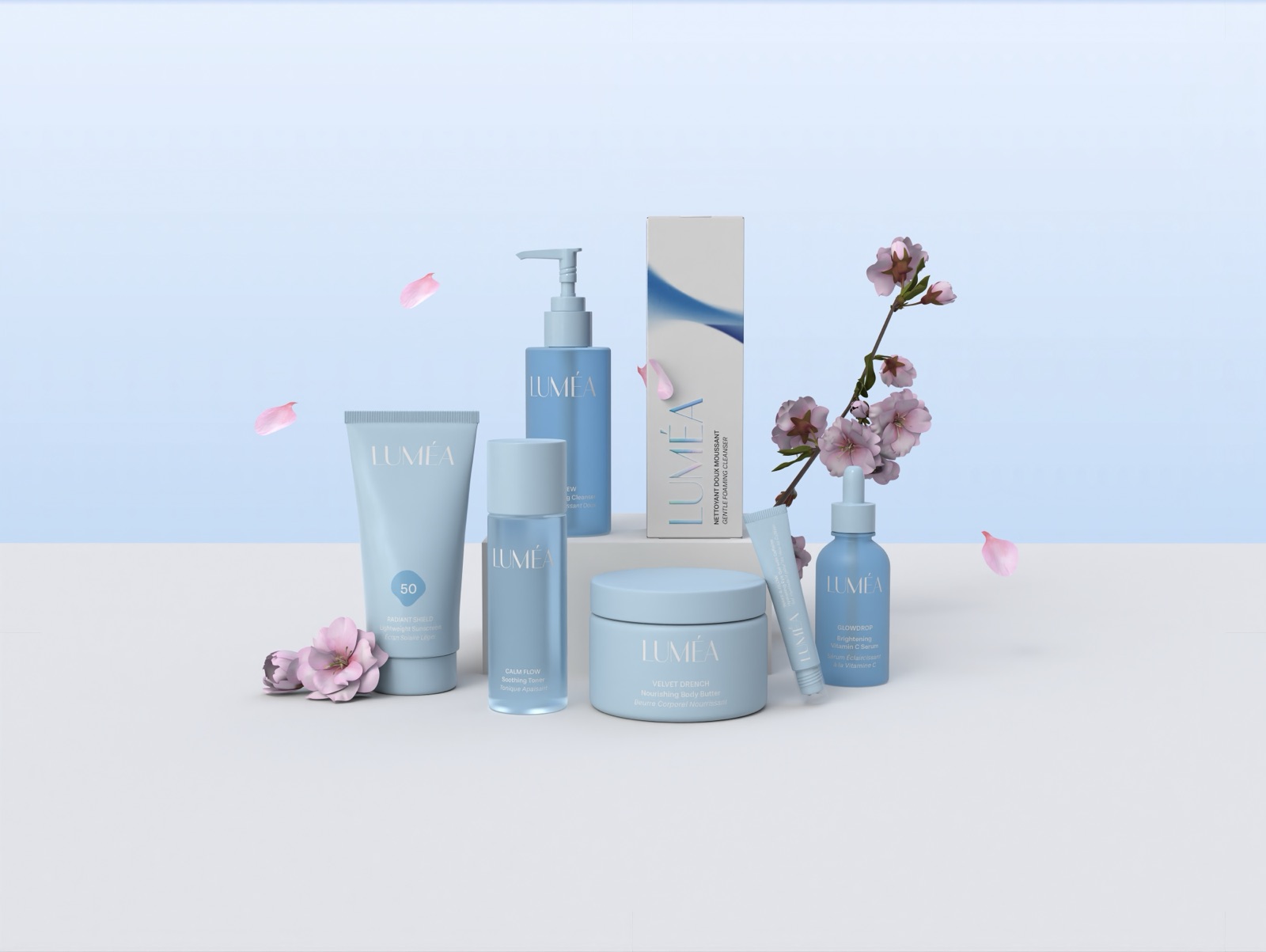
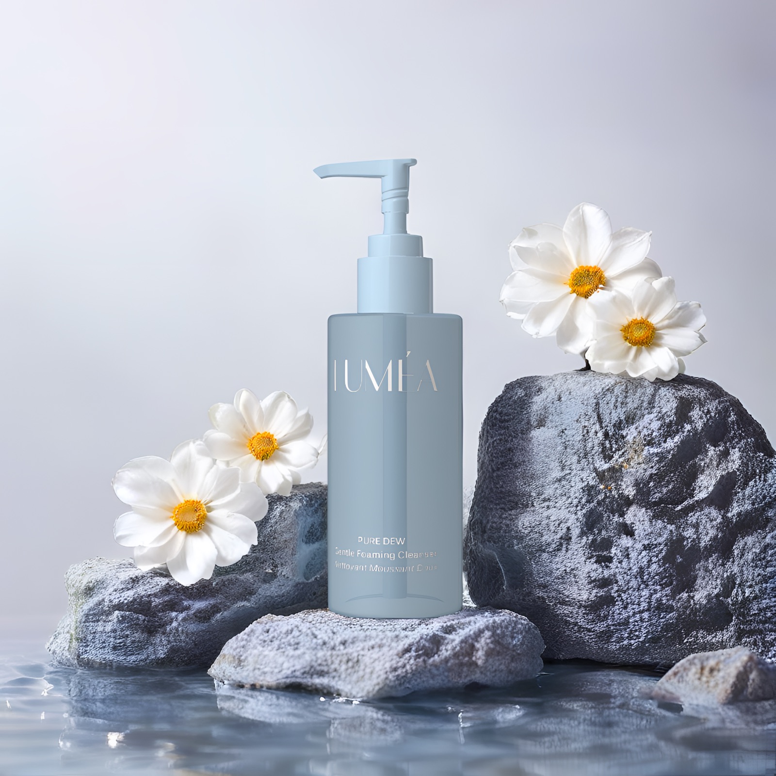
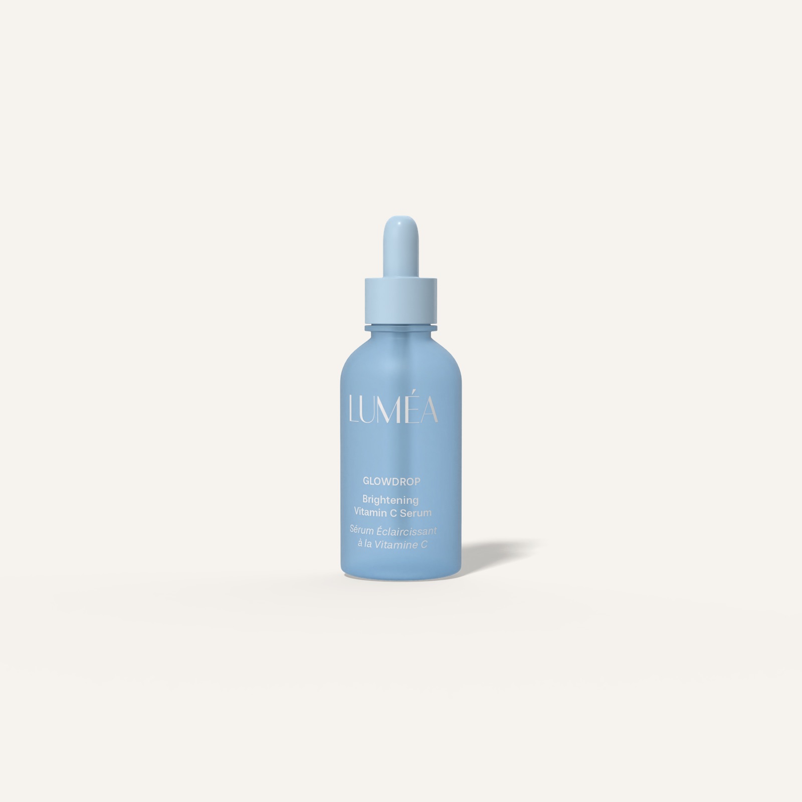
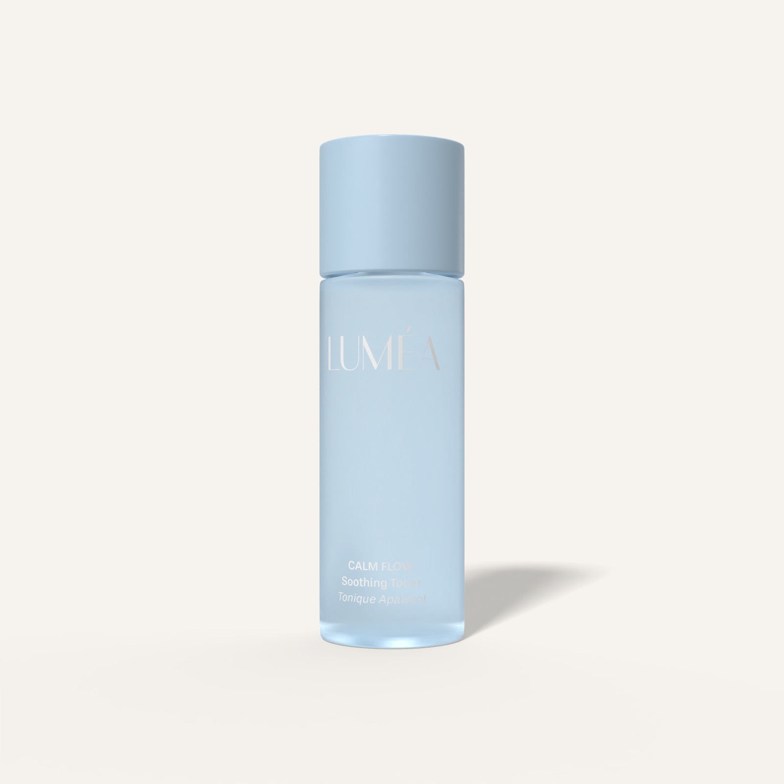
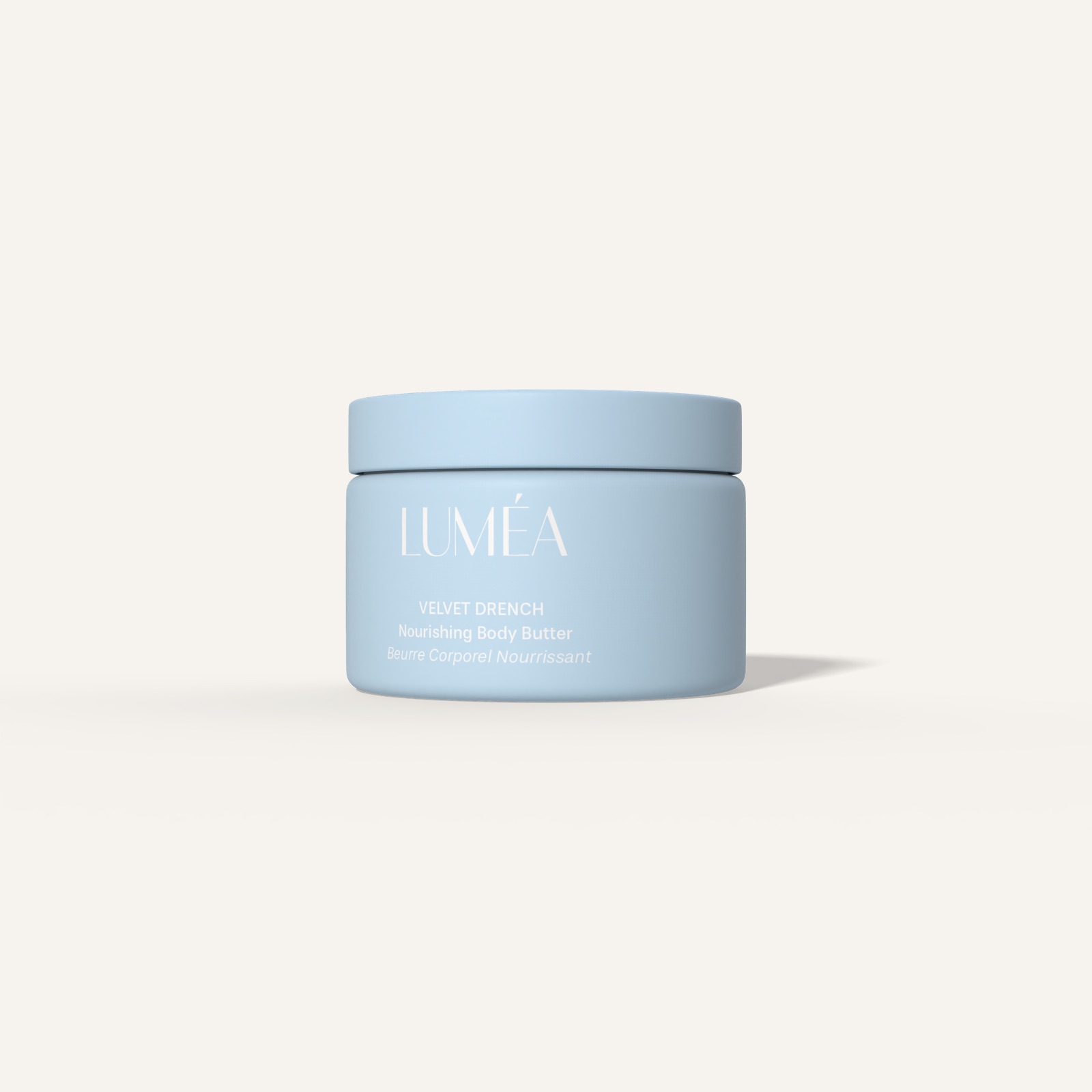
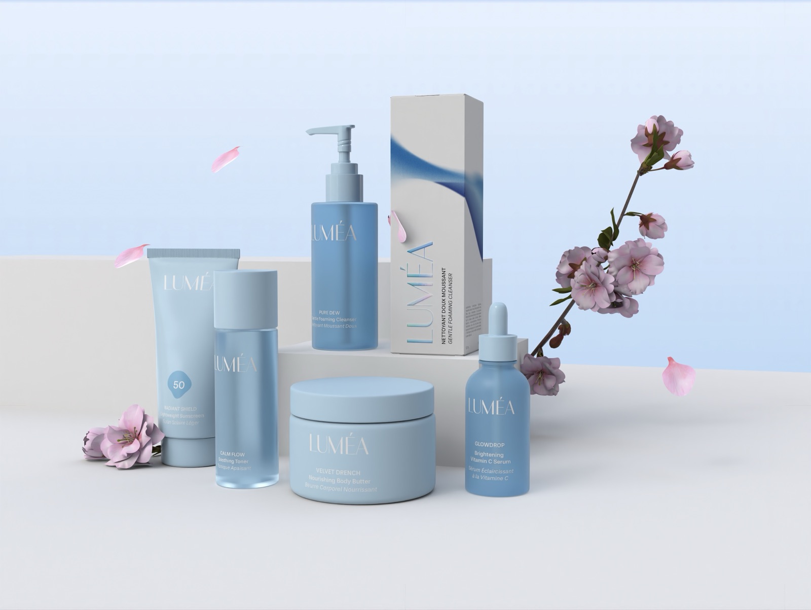
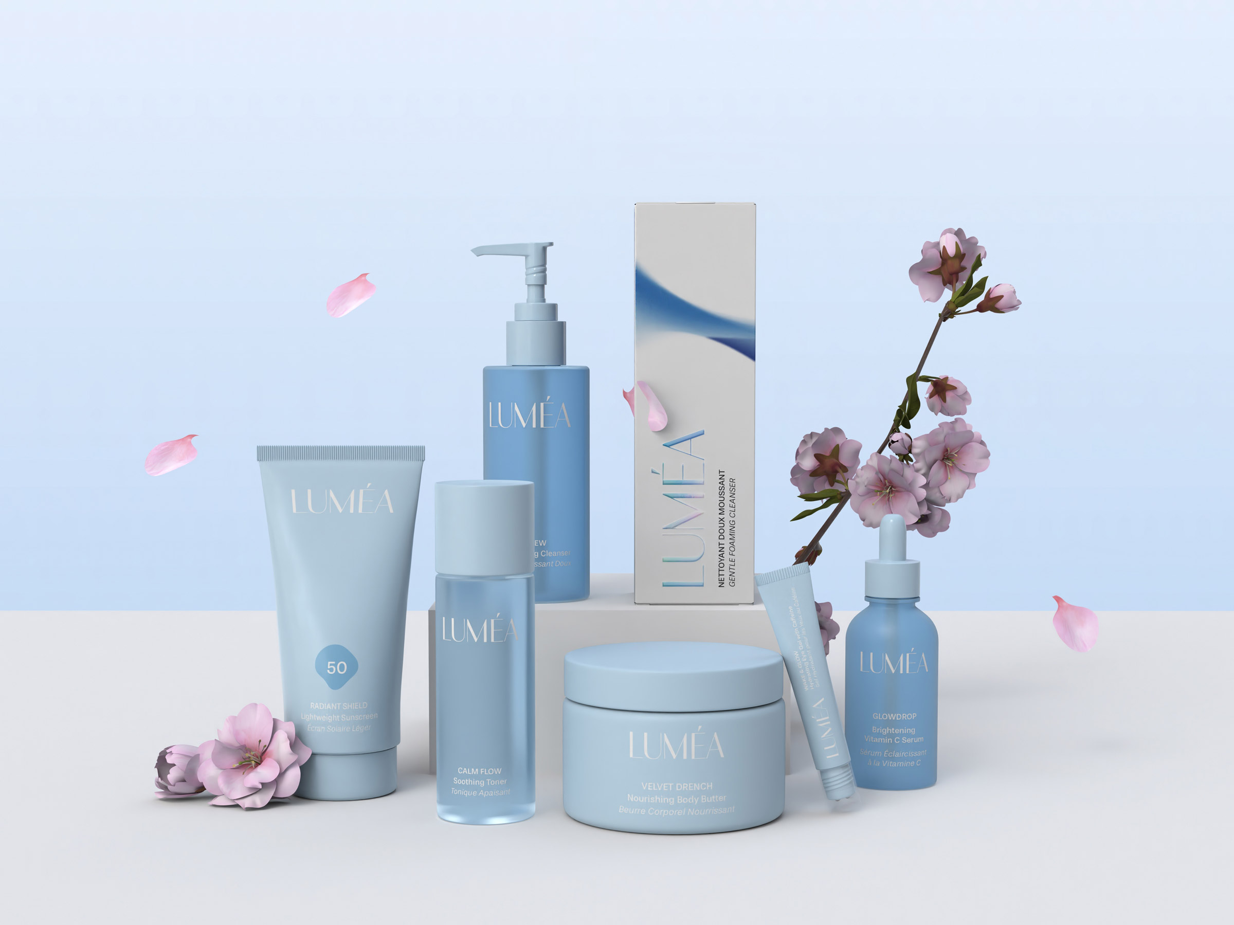
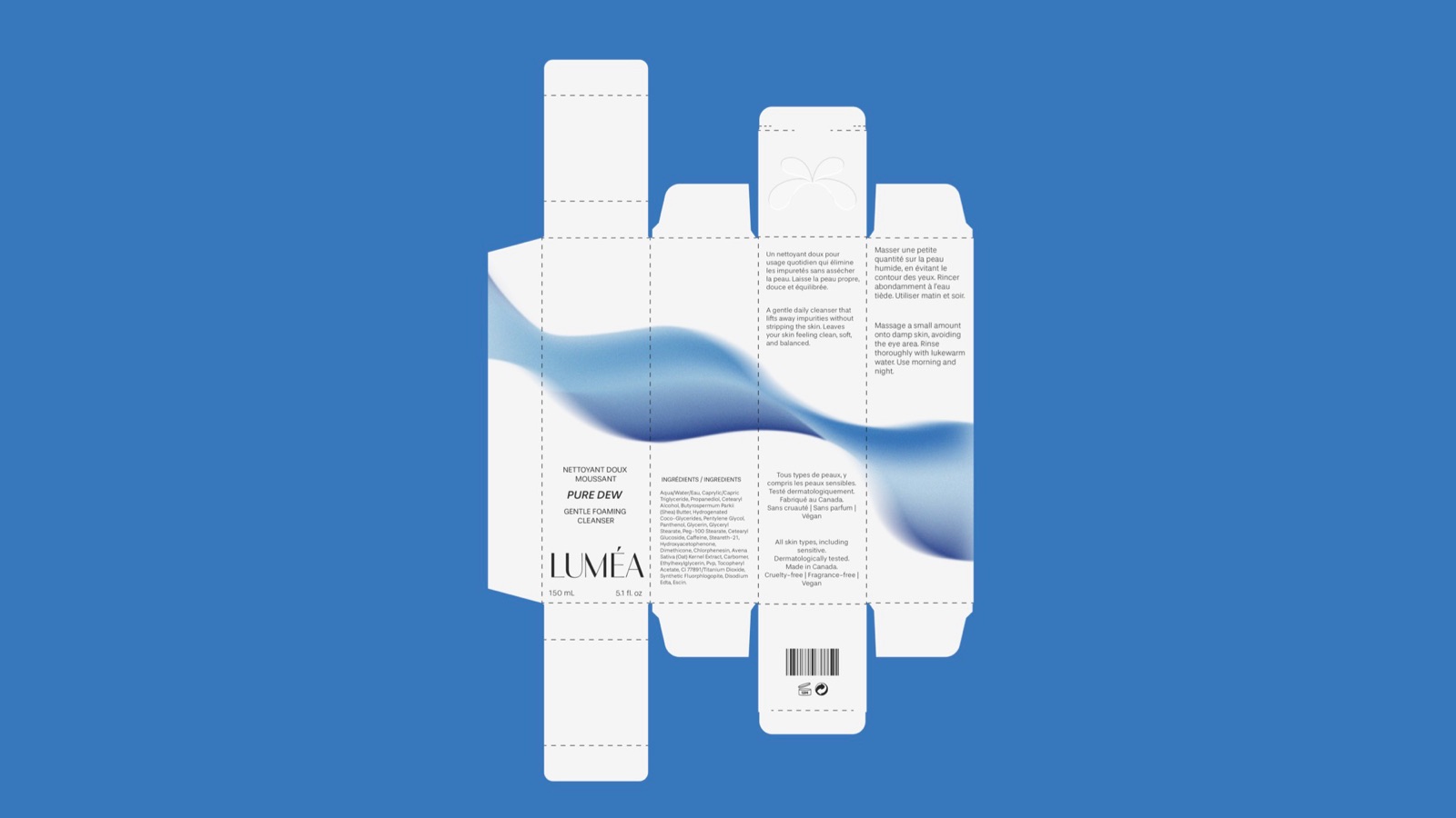
I applied the identity to a box dieline with the blue ribbon wrapping around it, then extended it across a full product line: cleanser, toner, serum, eye gel, SPF and body butter.
Deliverables
- Primary logo, secondary logo and logomark
- Typography, palette and brand illustrations
- Box dieline and packaging mockups
- Product line mockups
Final work