Forêt d'Or
Maple Syrup Gift Set
Overview
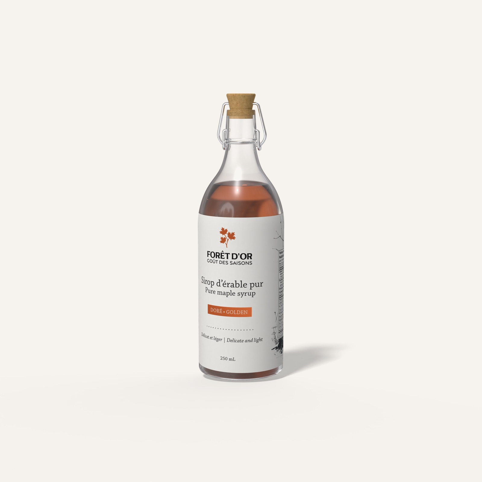
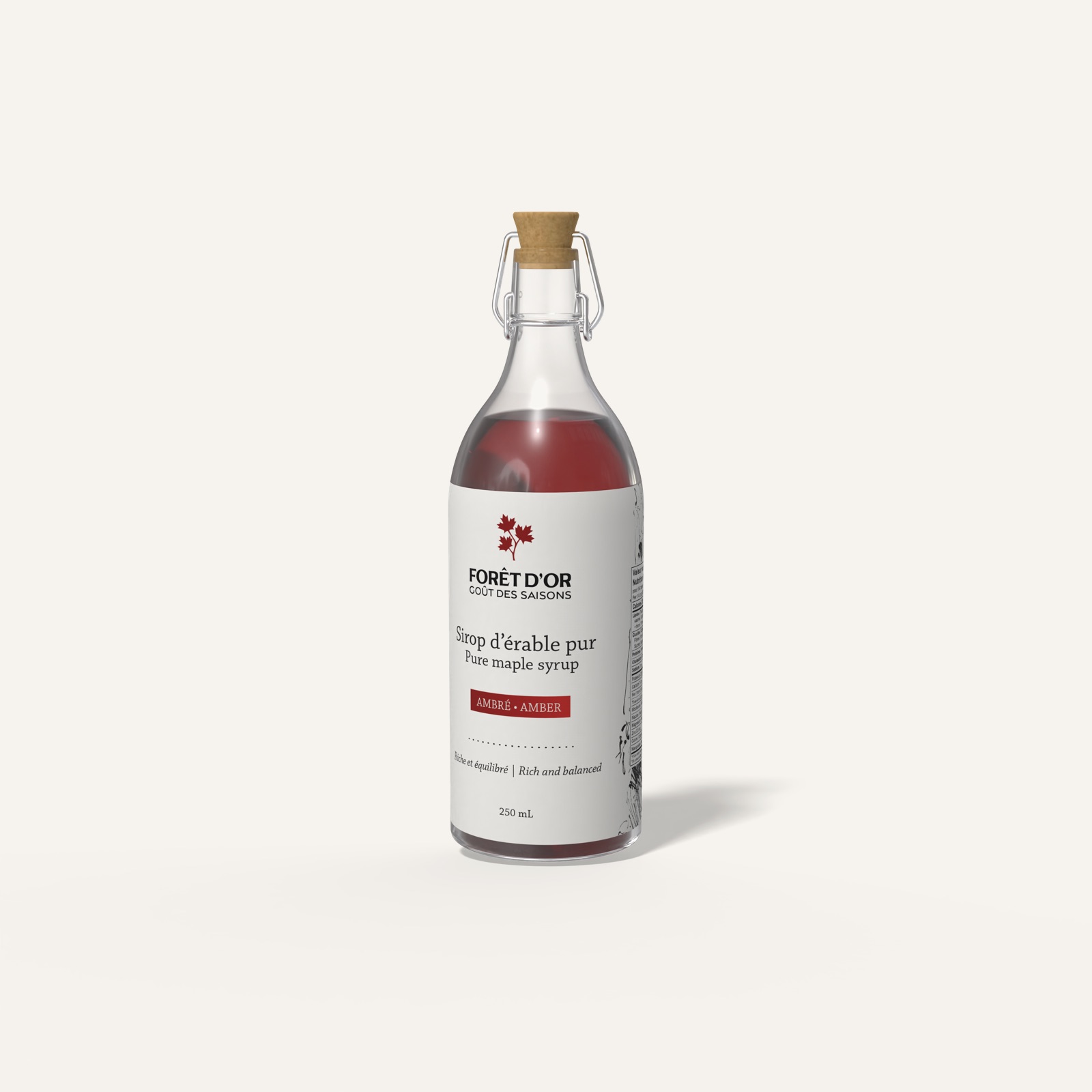
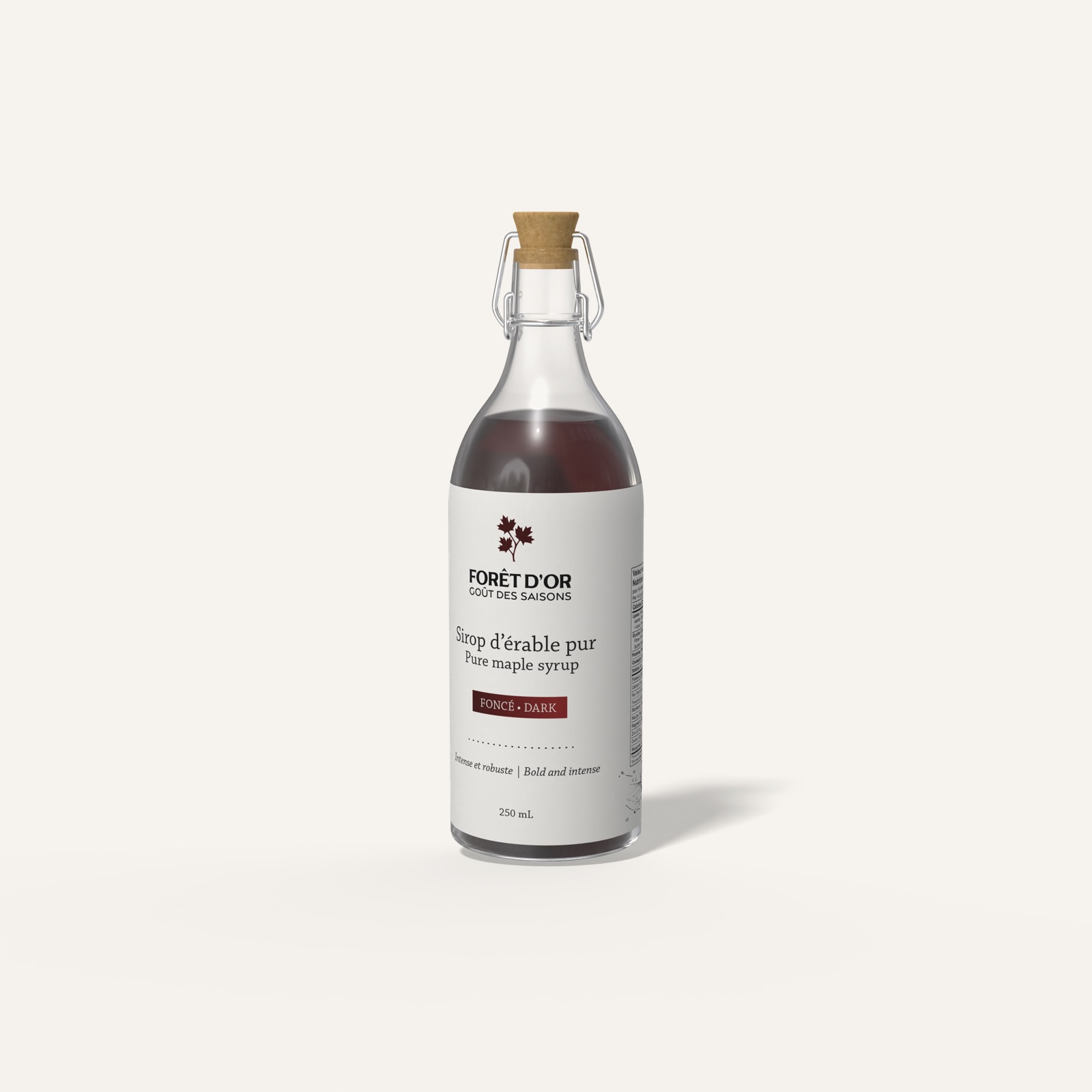
Forêt d'Or ("Golden Forest") is a maple syrup brand I created for travellers passing through Montréal's airport. The gift set holds three syrups, golden, amber and dark, each in a reusable glass bottle with a small recipe booklet attached. I designed the full identity: logos, typography, palette, pattern, hand-drawn illustrations, labels, booklets and the box.
The brief
Design a trilogy of maple syrups (light, amber and dark) presented as a discovery gift set and sold at the Montréal airport. The goal was a strong visual identity rooted in Québec culture that leaves travellers with a sweet, memorable impression of Québec.
Research
Positioning
Forêt d'Or offers a trilogy of maple syrups that reveals the richness of Québec's seasons and traditions. Each gift set includes a booklet of recipes and stories for savouring maple as a way of life.
Values
- A keepsake to give and to keep. A durable recipe booklet and reusable bottles make the experience last.
- A premium feel. Packaging that is both luxurious and practical: well-designed glass bottles that reseal.
Personas
- Travellers looking for a local souvenir: a meaningful, authentic memento of their stay in Québec.
- Travellers looking for a last-minute gift: in a rush, but still wanting something thoughtful, refined and representative of the region.
Process
01 · Moodboard
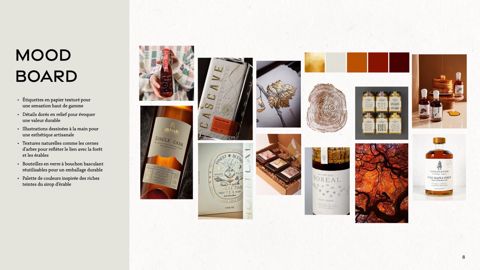
- Textured paper labels for a premium feel
- Embossed gold details to suggest lasting value
- Hand-drawn illustrations for a handcrafted look
- Natural textures like tree rings, for the connection to the forest
- Reusable swing-top glass bottles for sustainable packaging
- A palette drawn from the rich tones of maple syrup
02 · Logos
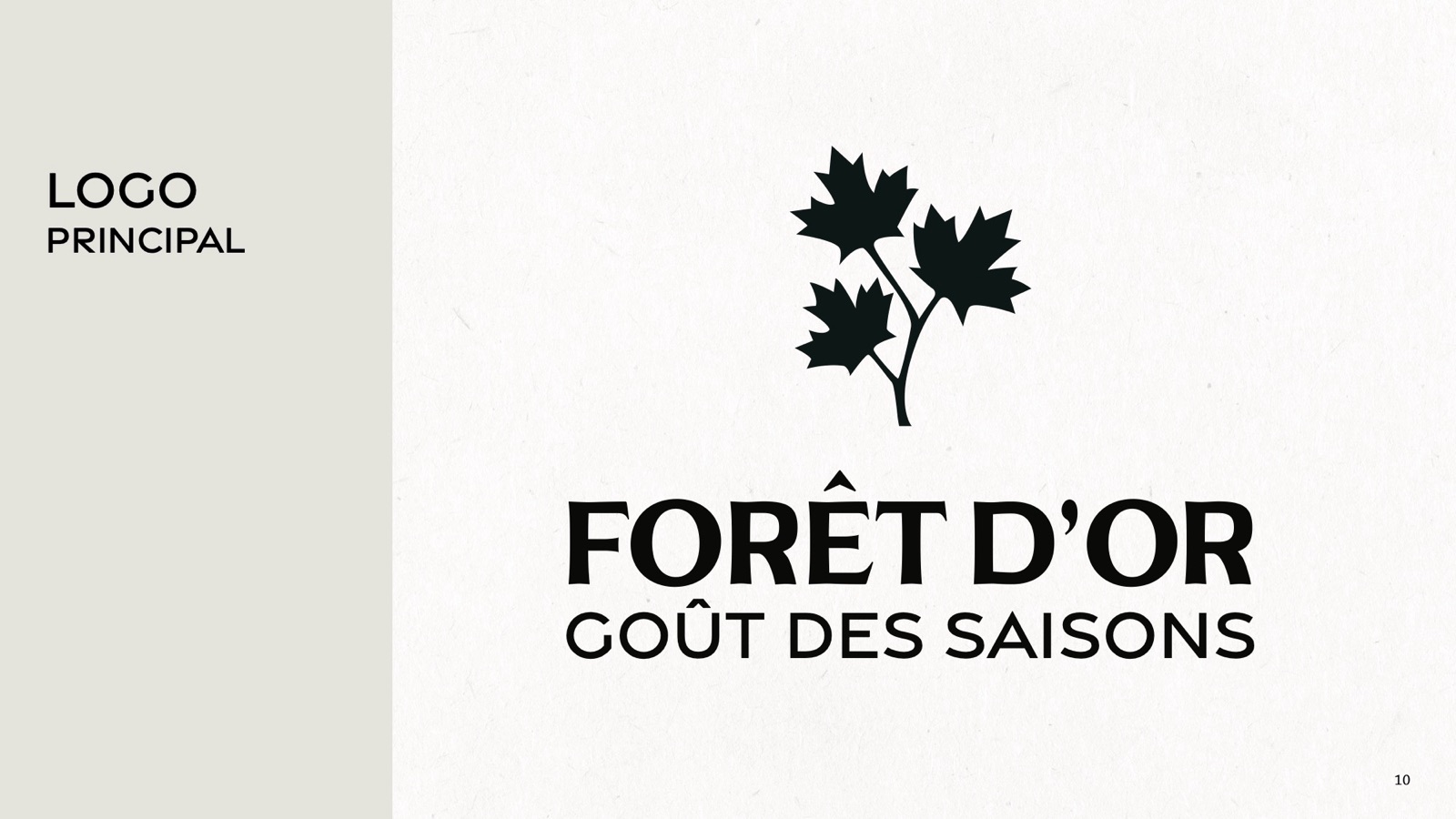
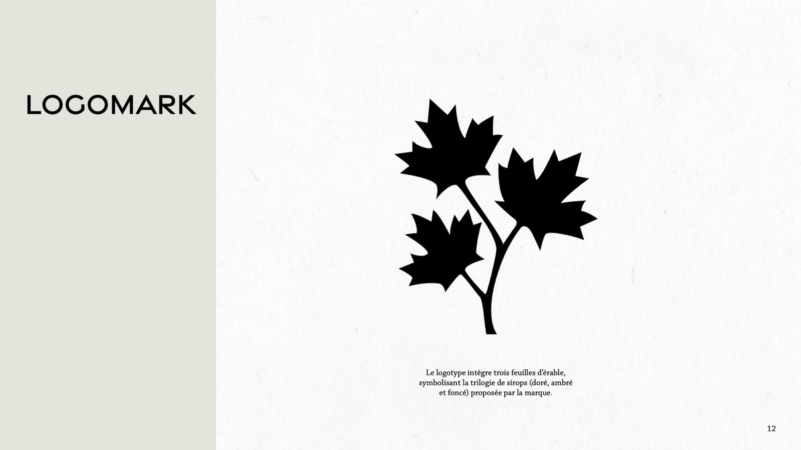
The primary logo places a maple branch above the wordmark with the tagline "Goût des saisons" ("Taste of the seasons"). The logomark is a branch with three maple leaves, one for each syrup in the trilogy.
03 · Sketches
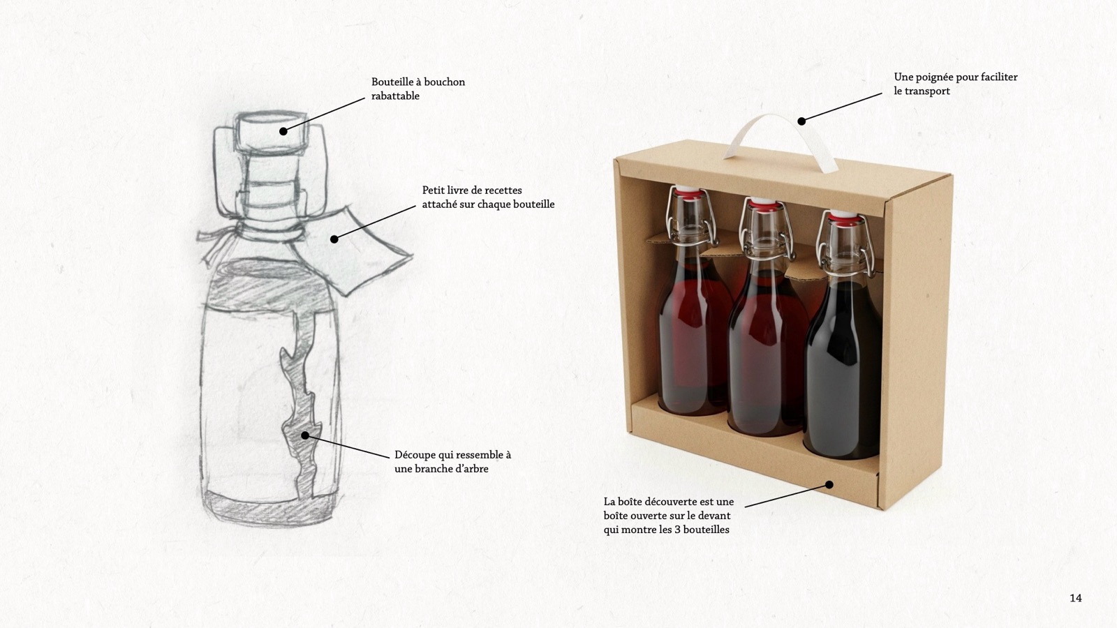
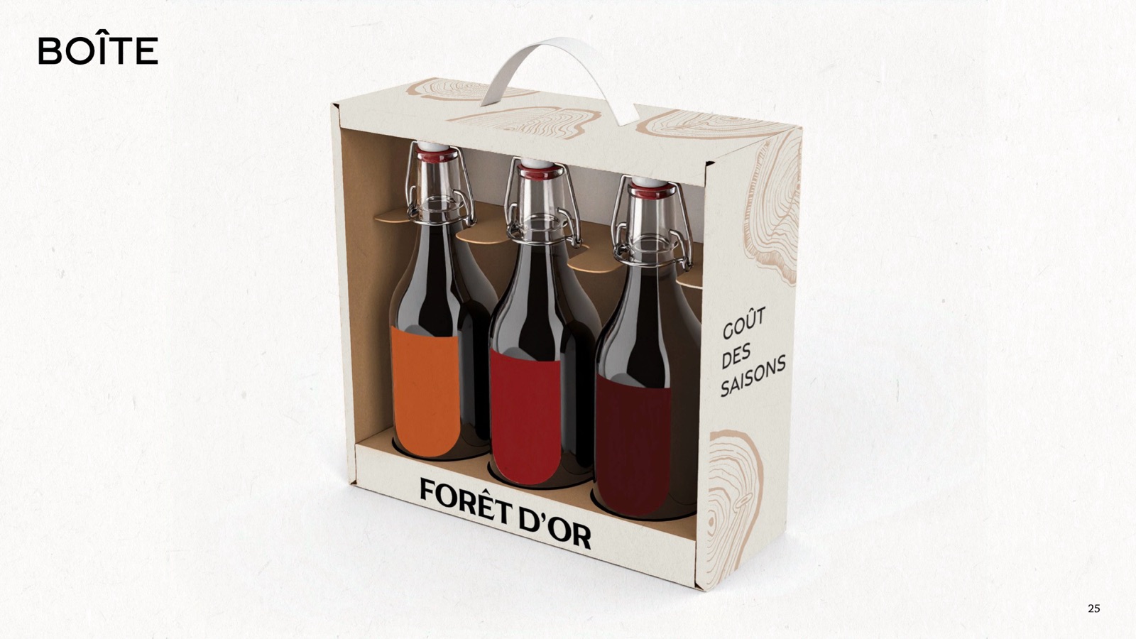
I sketched the bottles and the box: a swing-top bottle, a recipe booklet tied to each one, a label cut-out shaped like a tree branch so the syrup shows through, and a carry box with a handle, open at the front to show all three bottles.
04 · Visual elements
Typography: Gravesend Sans Medium for headings, Chaparral Pro Caption for text.
| Colour | Hex |
|---|---|
| Paper | #e6e3dc |
| Golden | #bb5627 |
| Amber | #891b1a |
| Dark | #431212 |
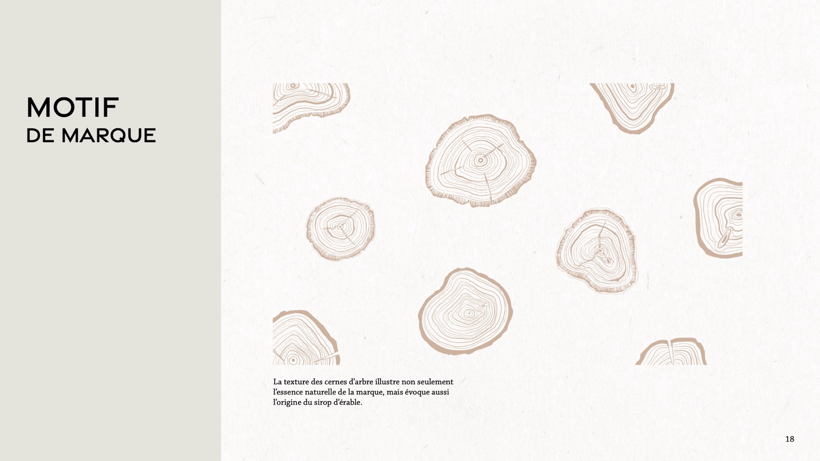
Pattern: a tree-ring texture that expresses the brand's natural side and points to where maple syrup comes from.
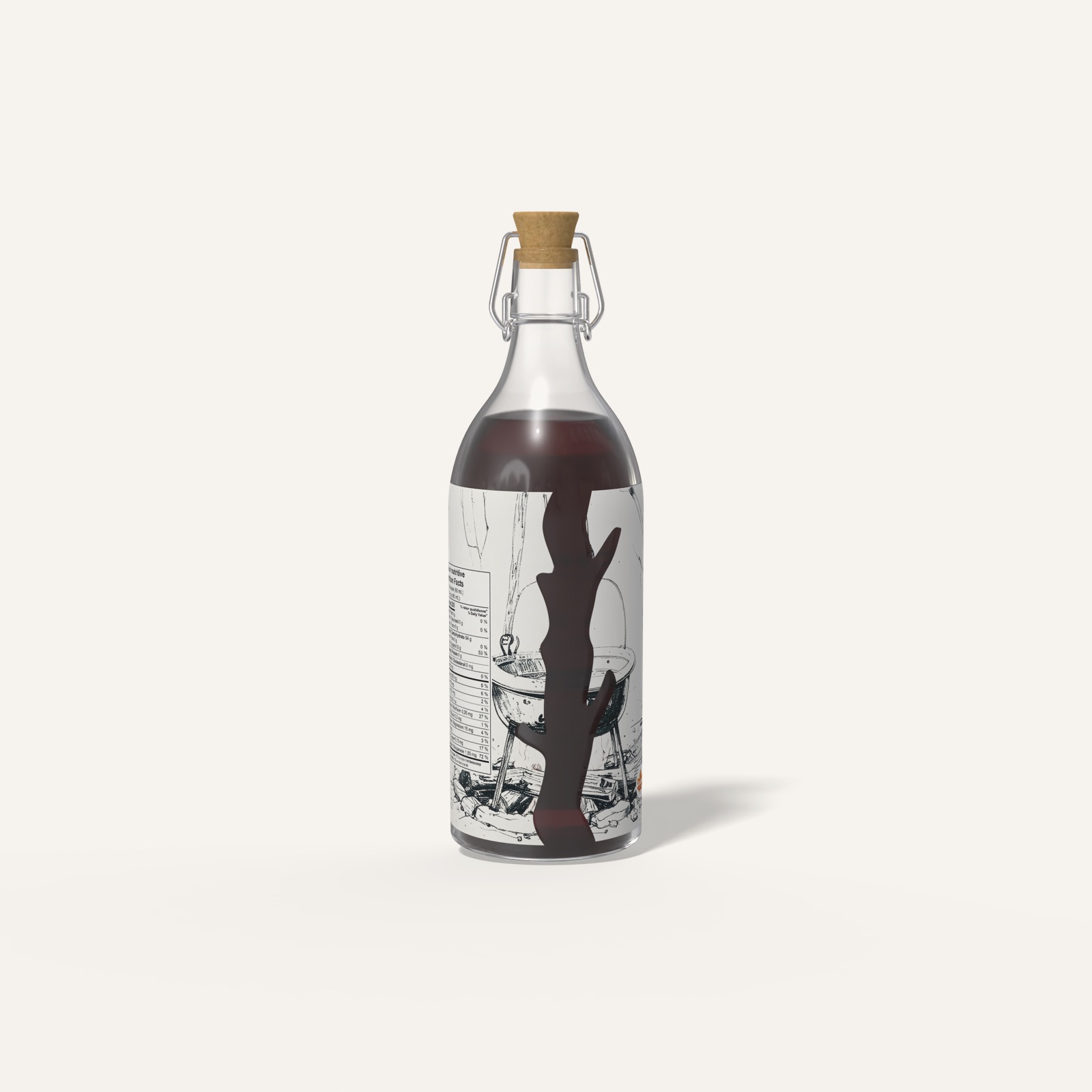
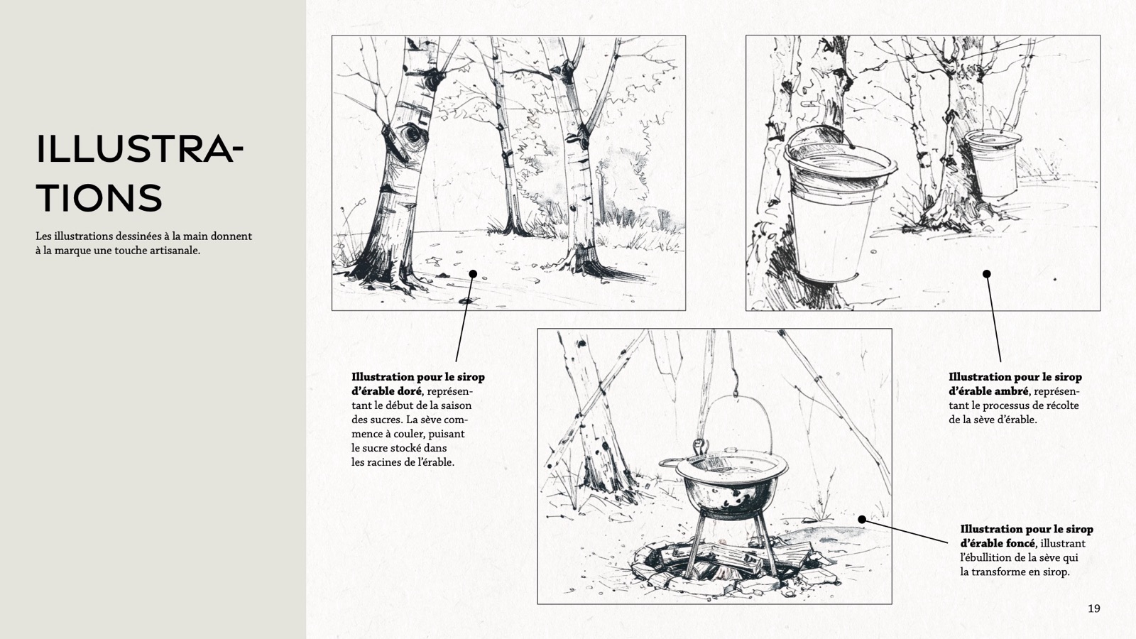
Illustrations: hand-drawn ink scenes, one per syrup. Golden shows the start of sugaring season, when the sap begins to flow. Amber shows the sap harvest. Dark shows the sap boiling down into syrup.
05 · Brand in action
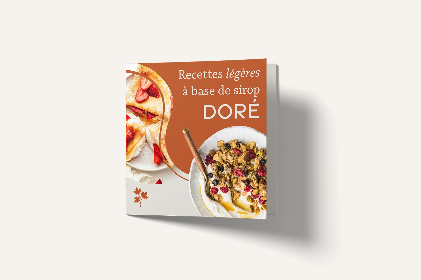
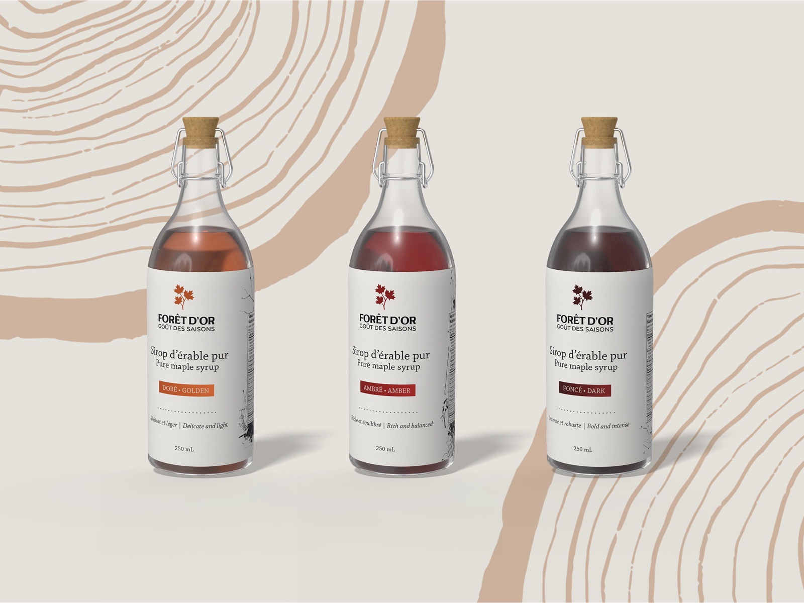
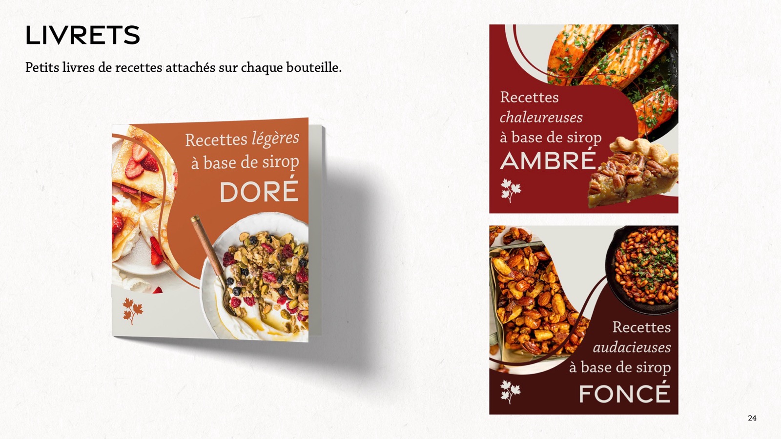
Each syrup gets its own label colour with its illustration on the back. Small recipe booklets hang from each bottle: light recipes with golden syrup, warming ones with amber, bold ones with dark. The box carries the tree-ring pattern and the tagline.
Deliverables
- Primary logo, secondary logo and logomark
- Typography, palette and tree-ring pattern
- Three hand-drawn illustrations
- Three bottle labels with front and back mockups
- Three recipe booklets
- Gift box
Final work