
La Classe
Restaurant Menu Redesign
Overview
A redesign of the menu for La Classe, the restaurant at Collège LaSalle, built to the restaurant's own specifications. I audited the existing menu, then delivered two proposals: one that follows the brief to the letter and one that bends it.
The brief
A one-page menu built to the specifications of the restaurant's contact:
- Simple and easy to edit, because it changes regularly
- Uses the client's typeface, Flama
- Includes two logos: LaSalle and the Hospitality and Tourism program
- White background, no bleed
- One page, one-sided, letter size, not folded
- Neutral colours, no food photos
- Nothing at the very top, because of the metal bars of the menu holder
- Bilingual, French and English
Research
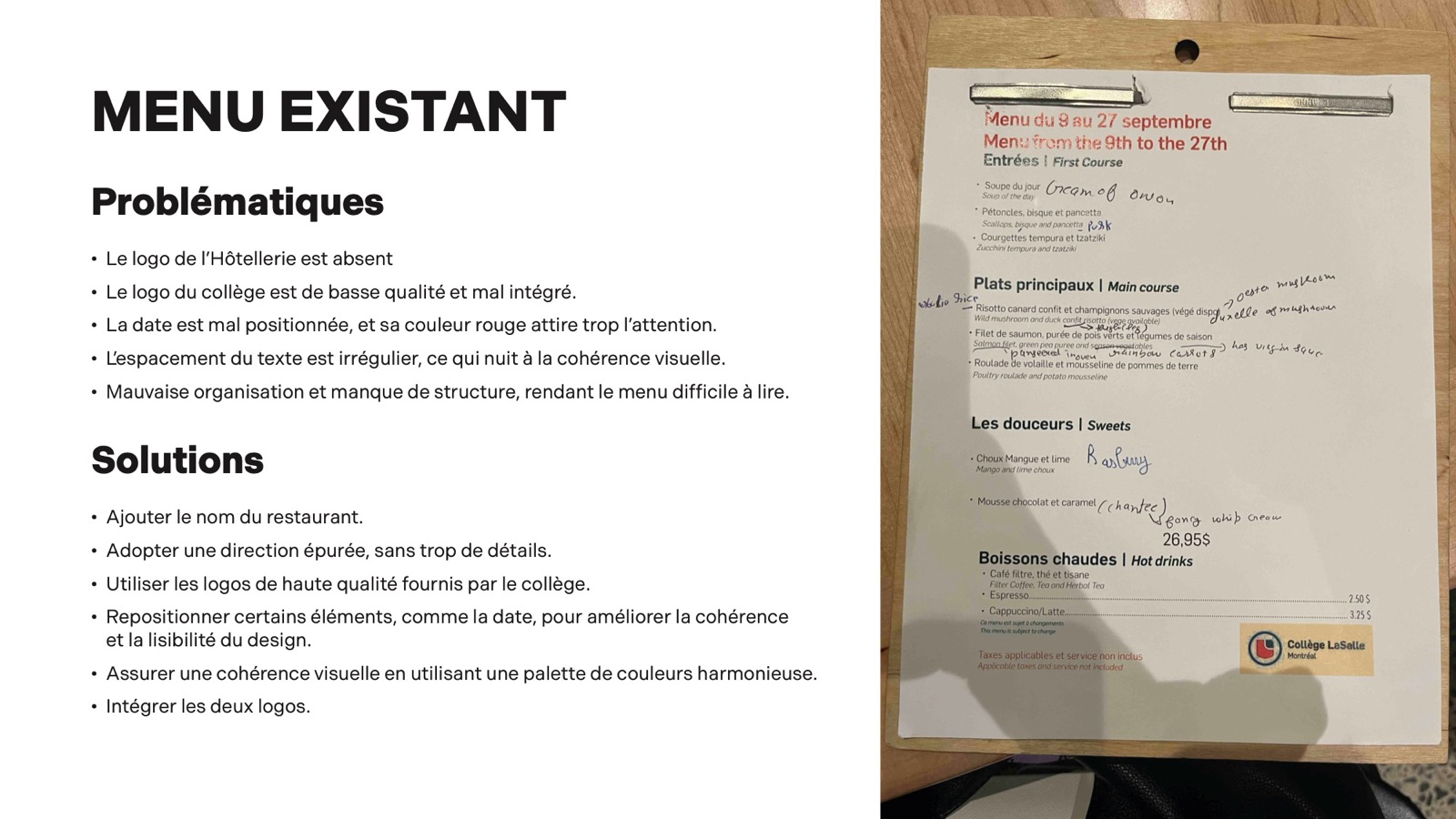
Problems with the existing menu
- The Hospitality logo is missing.
- The college logo is low quality and poorly integrated.
- The date is badly placed, and its red draws too much attention.
- The text spacing is uneven.
- Poor organisation and no clear structure make it hard to read.
Solutions
- Add the restaurant's name.
- Go for a clean direction without too much detail.
- Use the high-quality logos from the college.
- Move elements like the date for consistency and readability.
- Use a harmonious palette.
- Include both logos.
Process
01 · Proposal 1: following the brief
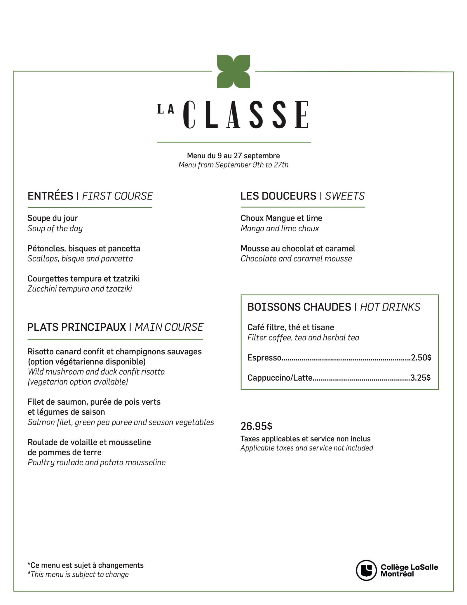
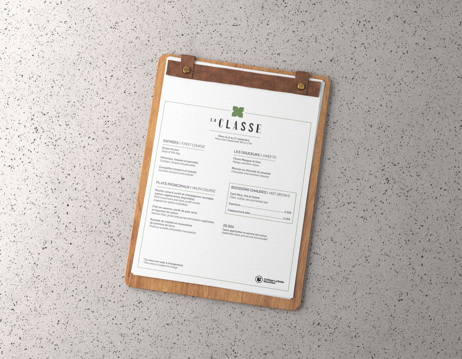
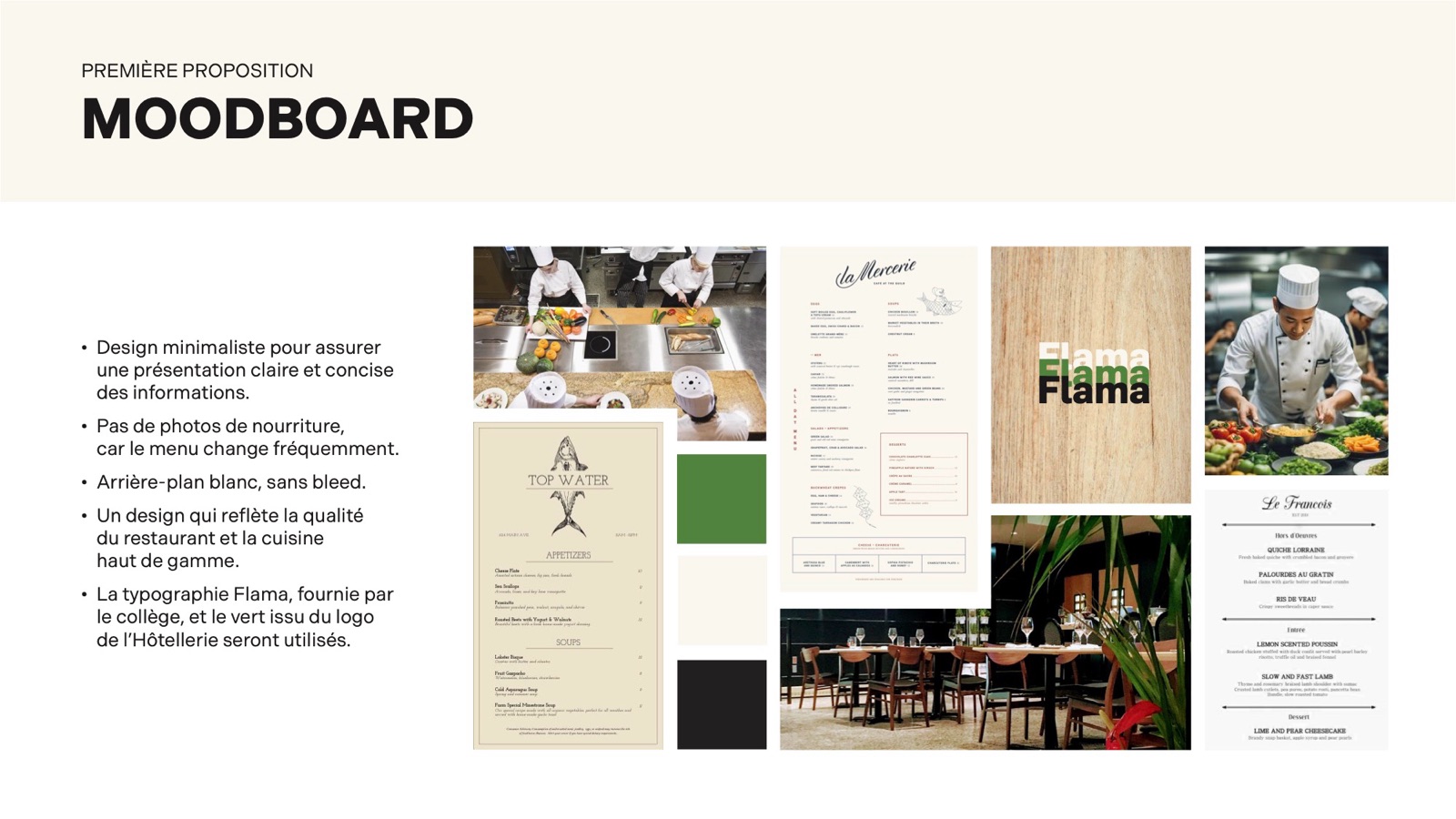
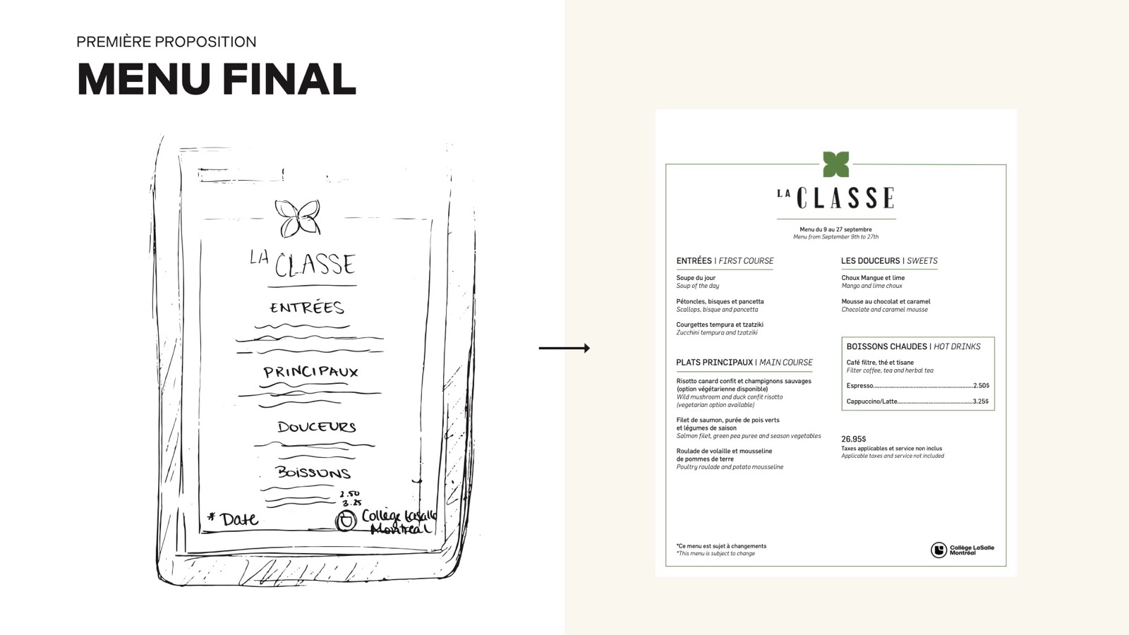
A minimalist design so the information reads clearly, no food photos, a white background with no bleed, and a look that reflects the restaurant's fine dining. It uses Flama and the green from the Hospitality logo.
I sketched a single centred column, then refined it into the final menu: the La Classe logo at the top, two columns with bilingual section headings, the table d'hôte price, and the tax and "subject to change" notes in both languages.
02 · Proposal 2: bending the brief
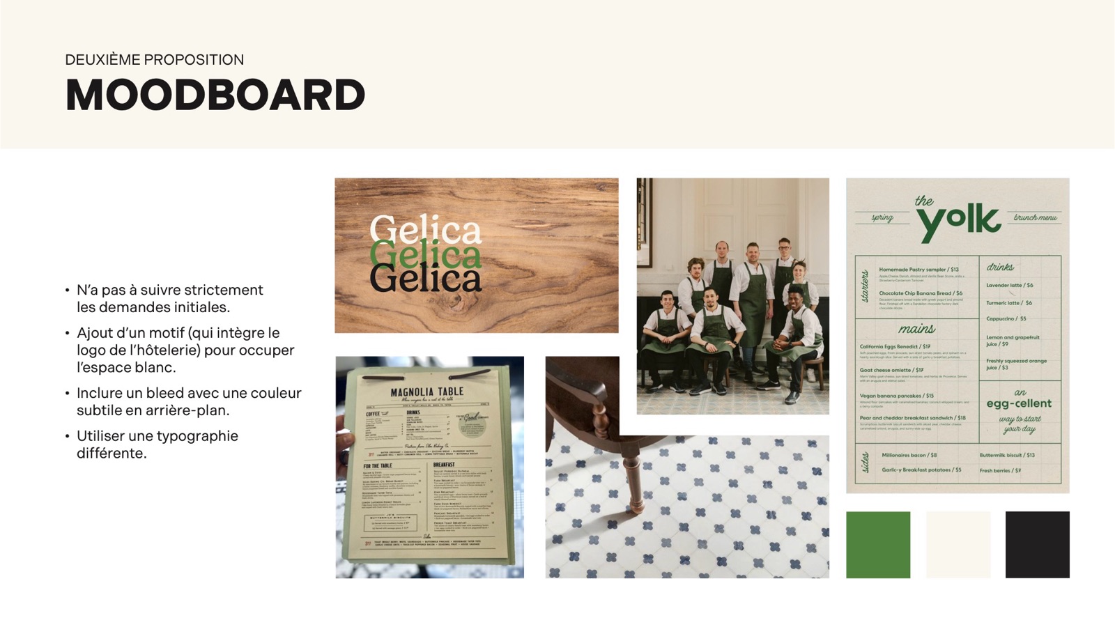
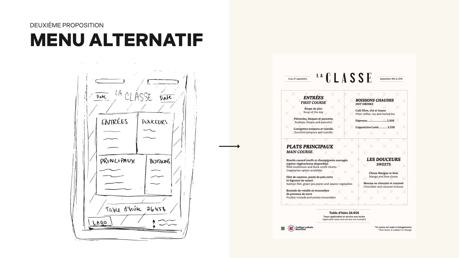
For the second proposal I stepped outside the original requests: a pattern built from the Hospitality logo to fill the white space, a bleed with a subtle background colour, and a different typeface, Gelica.
I sketched a grid of four boxed sections, then designed the final version on a warm cream background with the title set between two bilingual labels and four framed sections.
Deliverables
- Audit of the existing menu
- Proposal 1, following the specifications
- Proposal 2, an alternative menu
Final work