Timbre Bleu
Interactive Travel Magazine
Overview
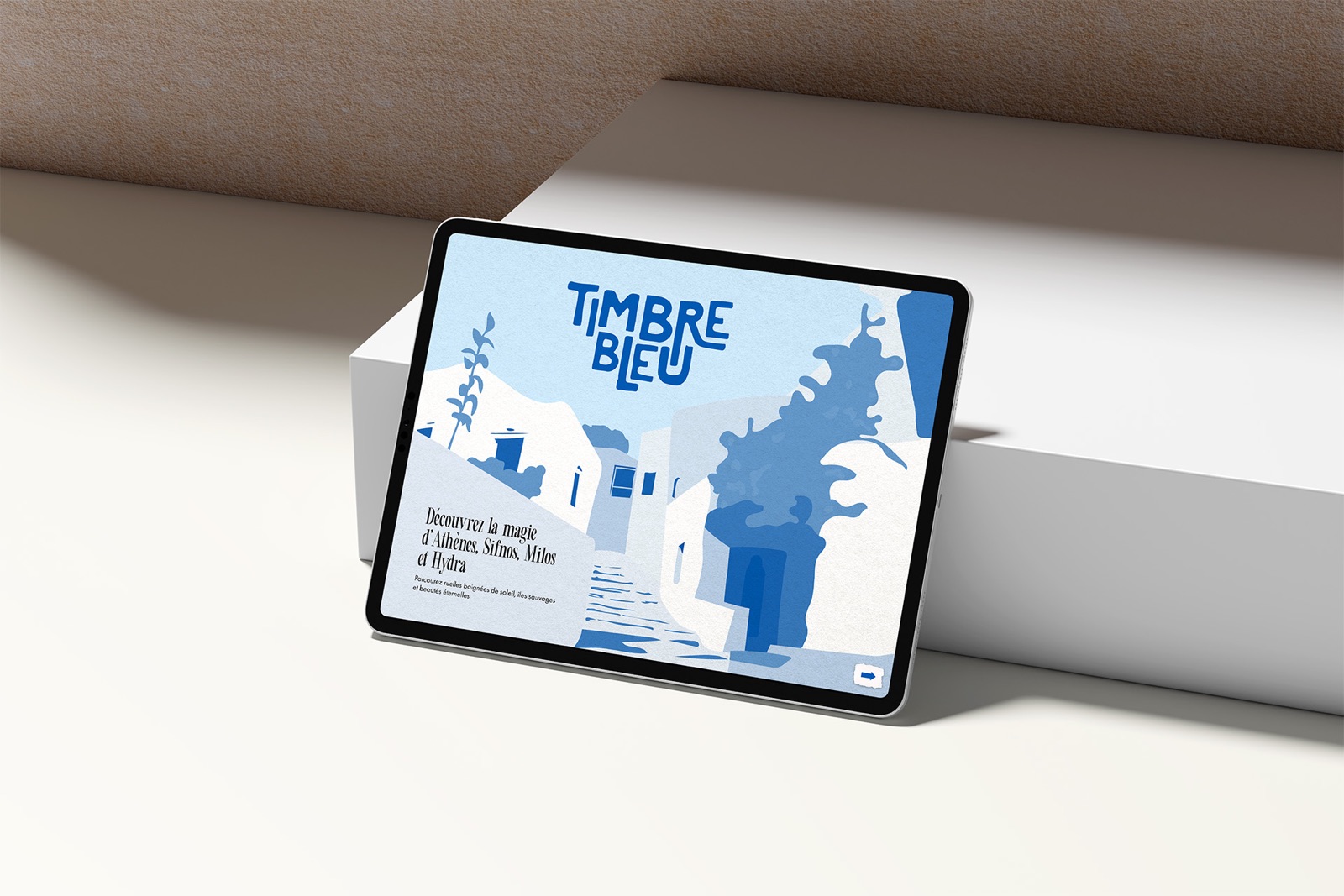
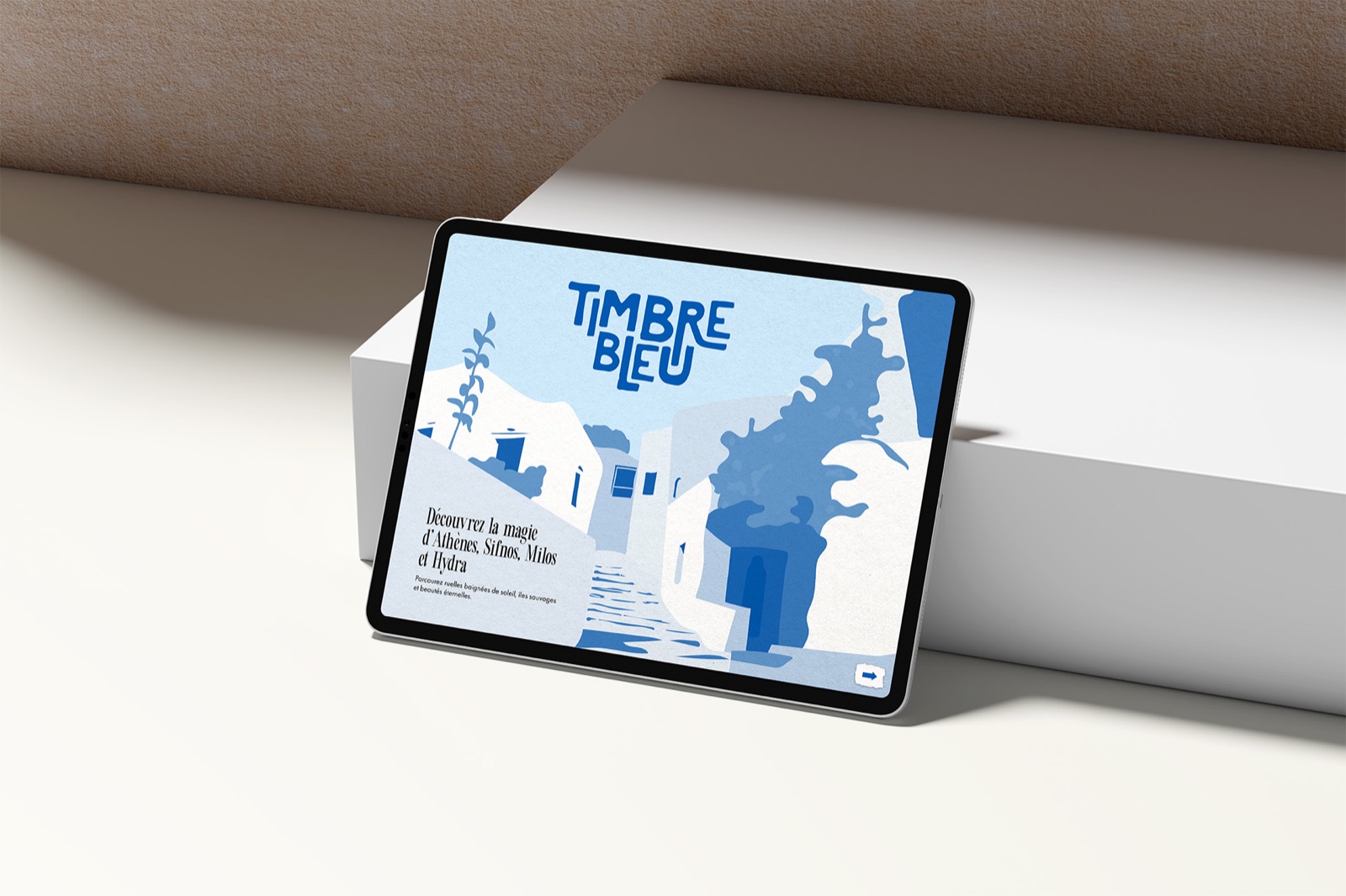
Timbre Bleu ("Blue Stamp") is an interactive travel magazine for iPad, built around my own trip to Greece. I designed its logo, palette, pattern and graphic elements, then laid out the full issue in InDesign with programmed navigation buttons.
The brief
Create a magazine designed for iPad. Interactivity was key, so navigation buttons programmed in InDesign were an essential part of the project.
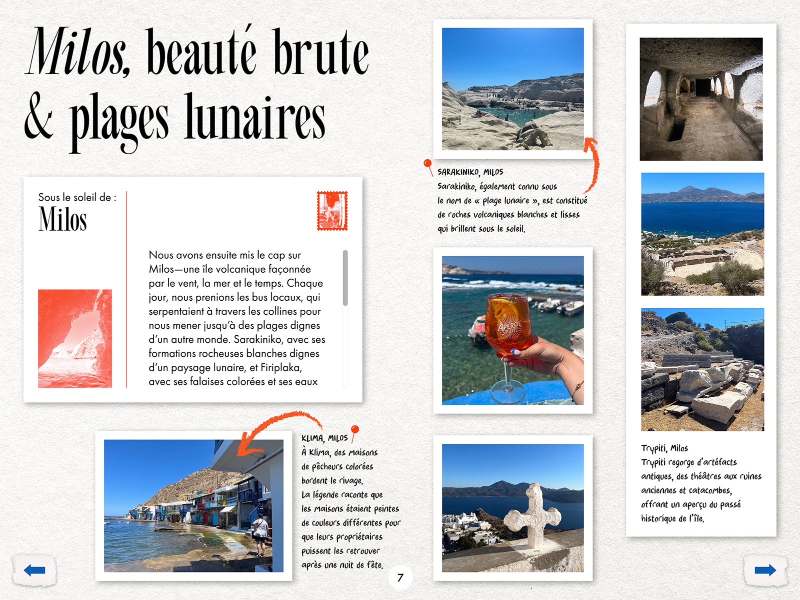
I chose a travel magazine centred on personal travel experiences in Greece. I had just visited for the first time, so it was a great chance to share the journey and some of my favourite photos.
Research
Defining personas ahead of time helped me understand who I was designing for. With a playful, aesthetic vision, I imagined the magazine for women passionate about everything to do with travel.
- Zoé, 17, the curious explorer. Inspired by other people's travel stories, she collects memories like postcards and dreams of planning her own adventures.
- Evelyne, 28, the passionate traveller. Always looking for unique places and visually striking experiences, she cares as much about the look as the substance.
- Alexandra, 35, travel agent. Interested in history and culture, she looks for authentic stories to guide her clients toward meaningful trips.
Process
01 · Moodboard
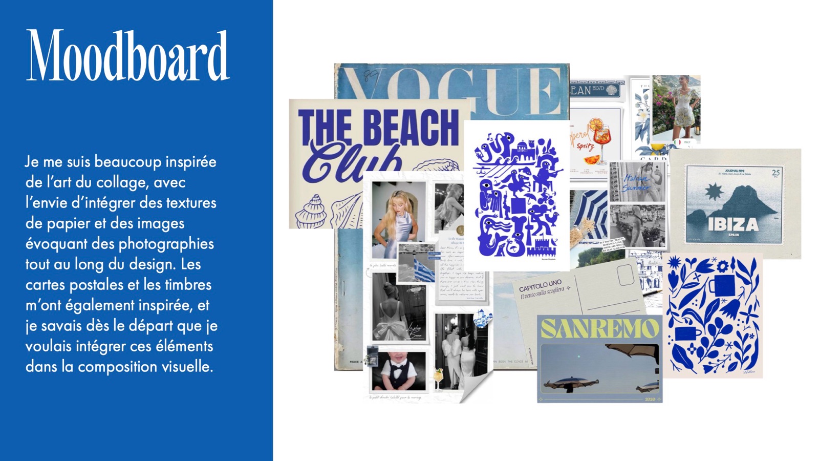
I drew a lot from collage, with paper textures and images that feel like photographs throughout. Postcards and stamps inspired me too, and I knew from the start I wanted them in the composition.
02 · Logo
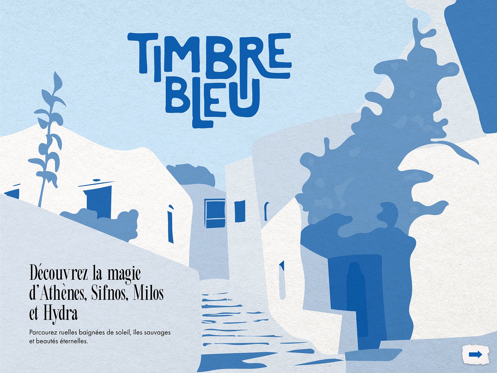
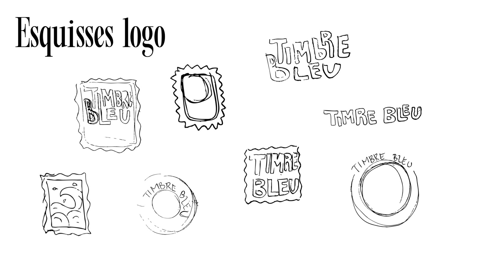
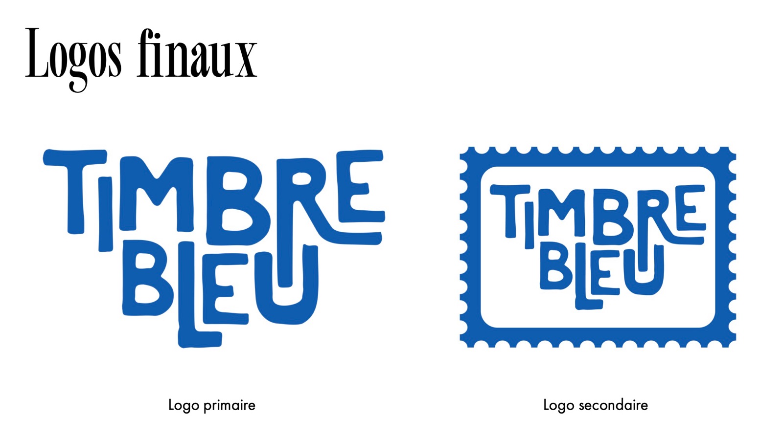
I sketched the name inside stamp shapes and as stacked hand lettering. The primary logo is "TIMBRE BLEU" in bold, playful letters on two lines. The secondary logo puts it inside a perforated stamp.
03 · Palette, pattern and elements
| Colour | Hex | RGB |
|---|---|---|
| Greek Blue | #0D5EAF | 13, 94, 175 |
| Athens Blue | #1734AF | 23, 52, 175 |
| Sifnos Turquoise | #7AE5E0 | 122, 229, 224 |
| Milos Orange | #F63F03 | 246, 63, 3 |
| Hydra Yellow | #F5BC27 | 245, 188, 39 |
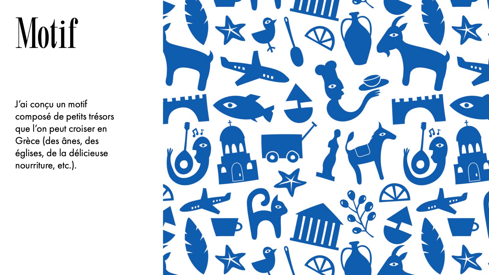
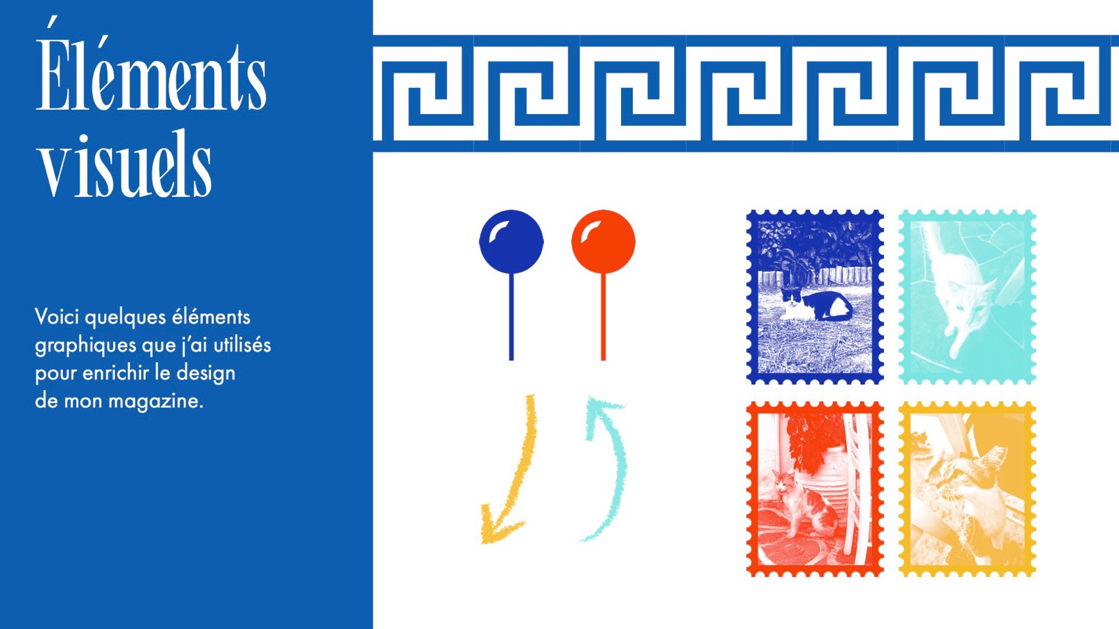
I designed a pattern of little treasures you might come across in Greece: donkeys, churches, delicious food, amphorae, boats and more. A Greek key border, map pins, hand-drawn arrows and stamp-framed photos enrich the layouts.
Typography: Beachwalk and Beachwalk Italic for headings, Futura PT Book for text, Arnold Letter for captions, Clay for the logo.
04 · The magazine
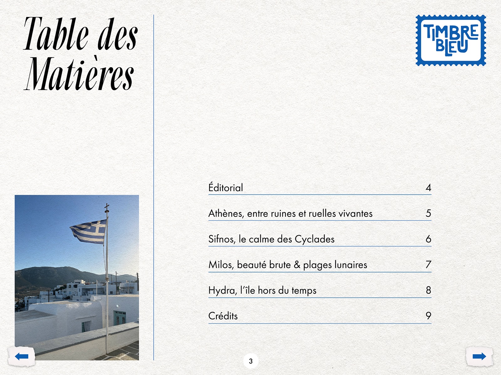
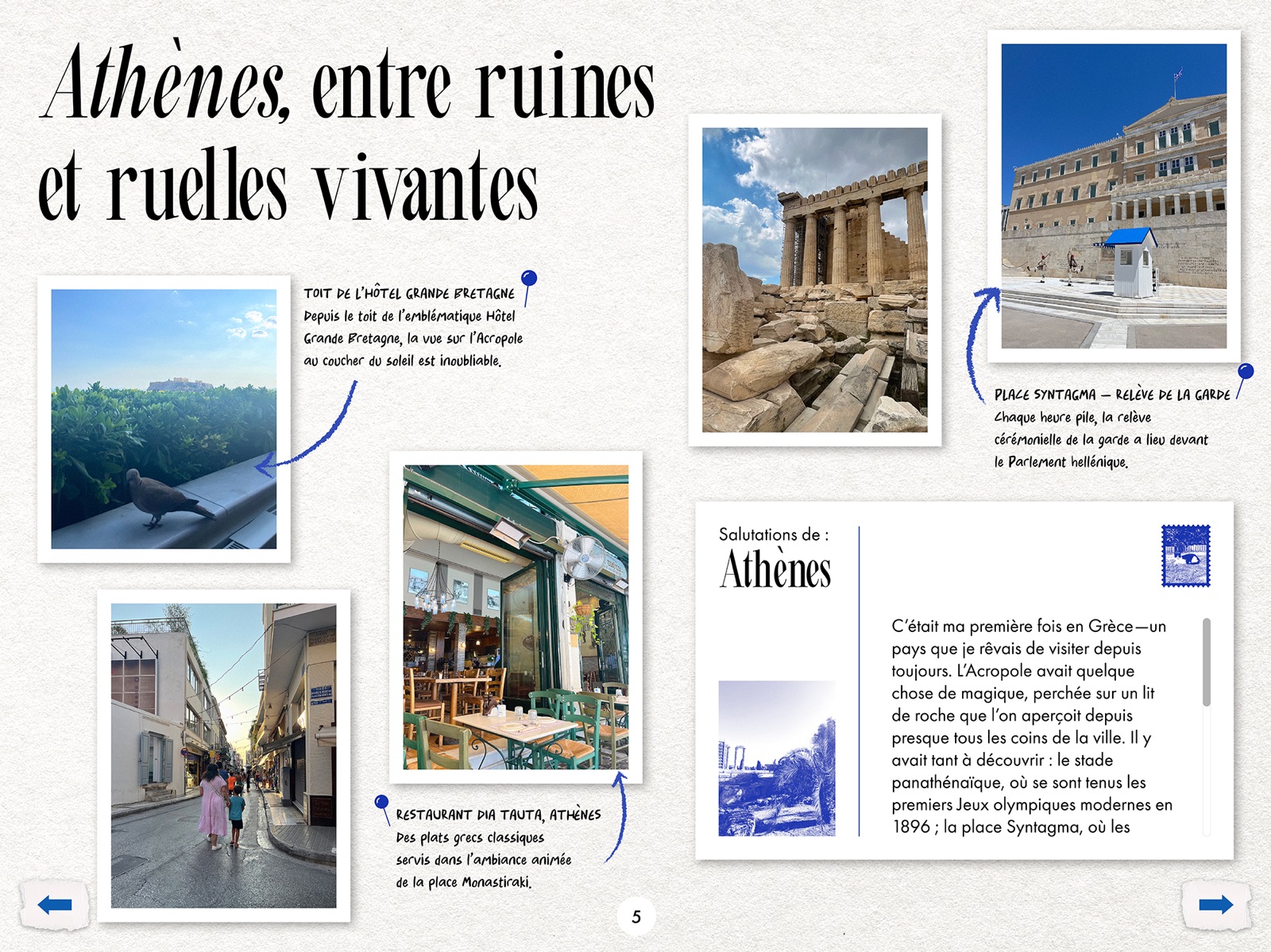
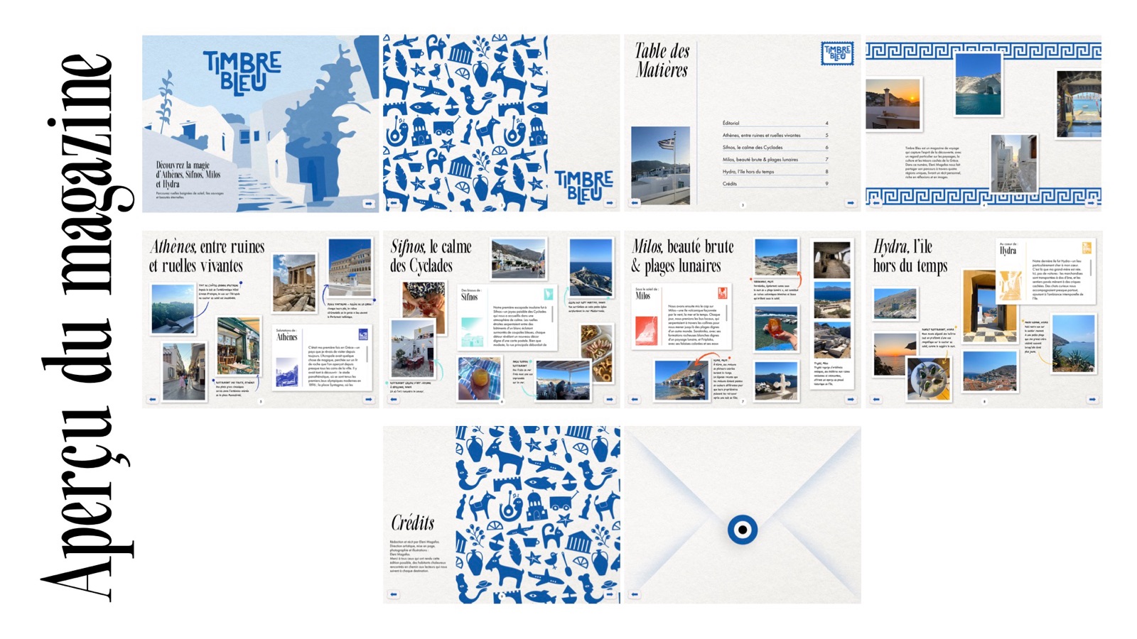
The issue opens with a cover, a pattern spread and a table of contents, then destination features on Athens, Sifnos, Milos and Hydra, and closes with credits and an envelope back cover sealed with an evil eye.
Deliverables
- Primary and secondary logos
- Palette, pattern and graphic elements
- Full interactive iPad magazine with navigation buttons
Final work