
Ben & Jerry's
Packaging Redesign
Overview
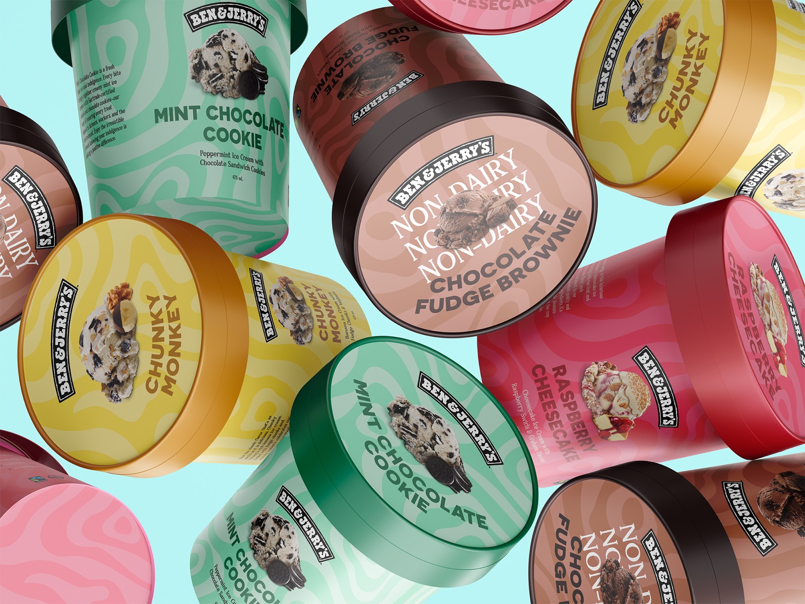
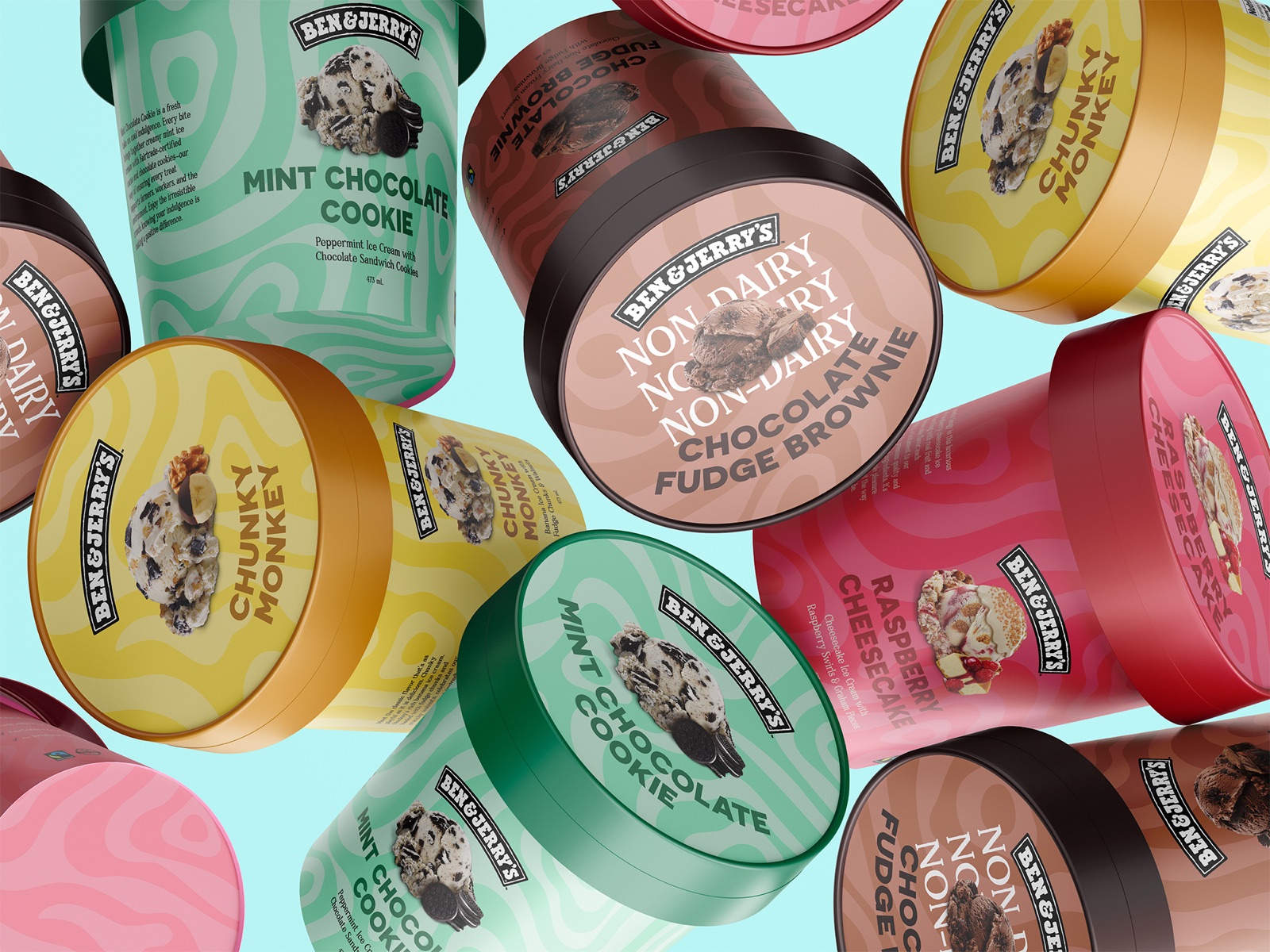
A redesign of Ben & Jerry's pint packaging across four flavours: Mint Chocolate Cookie, Chocolate Fudge Brownie, Chunky Monkey and Raspberry Cheesecake. The classic logo stays, and everything around it is new: a swirling pattern and a colour system that gives each flavour its own identity.
Process
01 · The system
- One pattern, four colourways. A wavy, topographic swirl wraps every pint in two tones of the flavour's colour: mint green, chocolate brown, banana yellow and raspberry pink.
- Lids in a deeper shade of the same colour, so the flavours are easy to tell apart on a shelf or stacked in a freezer.
- The classic Ben & Jerry's logo, kept as the anchor of the front panel and the lid.
02 · Front and lid
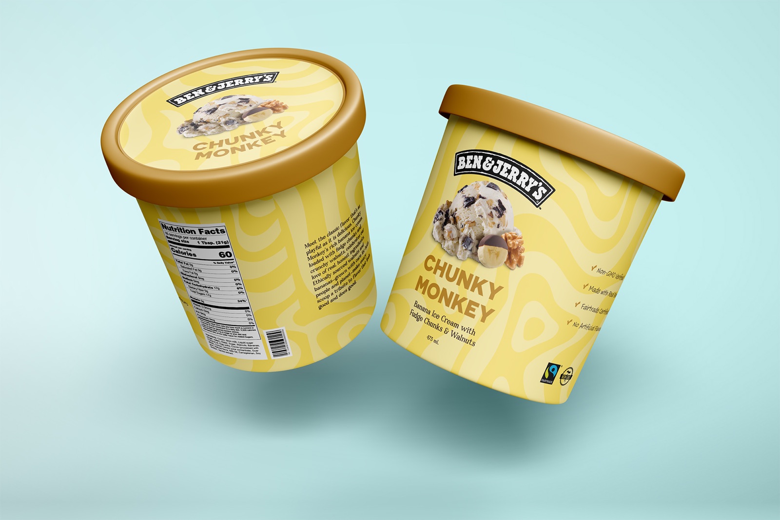
Each front has the logo, a scoop photo with the flavour's ingredients, the flavour name in bold rounded capitals, a one-line description and the volume. The lid repeats the logo, the scoop and the name.
| Flavour | Description |
|---|---|
| Mint Chocolate Cookie | Peppermint ice cream with chocolate sandwich cookies |
| Chocolate Fudge Brownie | Chocolate non-dairy frozen dessert with fudge brownies |
| Chunky Monkey | Banana ice cream with fudge chunks and walnuts |
| Raspberry Cheesecake | Cheesecake ice cream with raspberry swirls and graham pieces |
03 · Non-dairy
The non-dairy Chocolate Fudge Brownie pint gets a "NON-DAIRY" band around its lid, so it stands out at a glance.
04 · Side and back
A side panel lists the pint's claims with hand-drawn check marks, next to the Fairtrade mark. The back carries a short story about the flavour and the nutrition facts.
Deliverables
- Packaging for four flavours: front, back and lid
- Mockups
Final work