Beautifully Lashed
Lash Studio Brand & Website
Overview
A new brand identity and website for Beautifully Lashed, a lash studio.
Process
01 · Brand identity
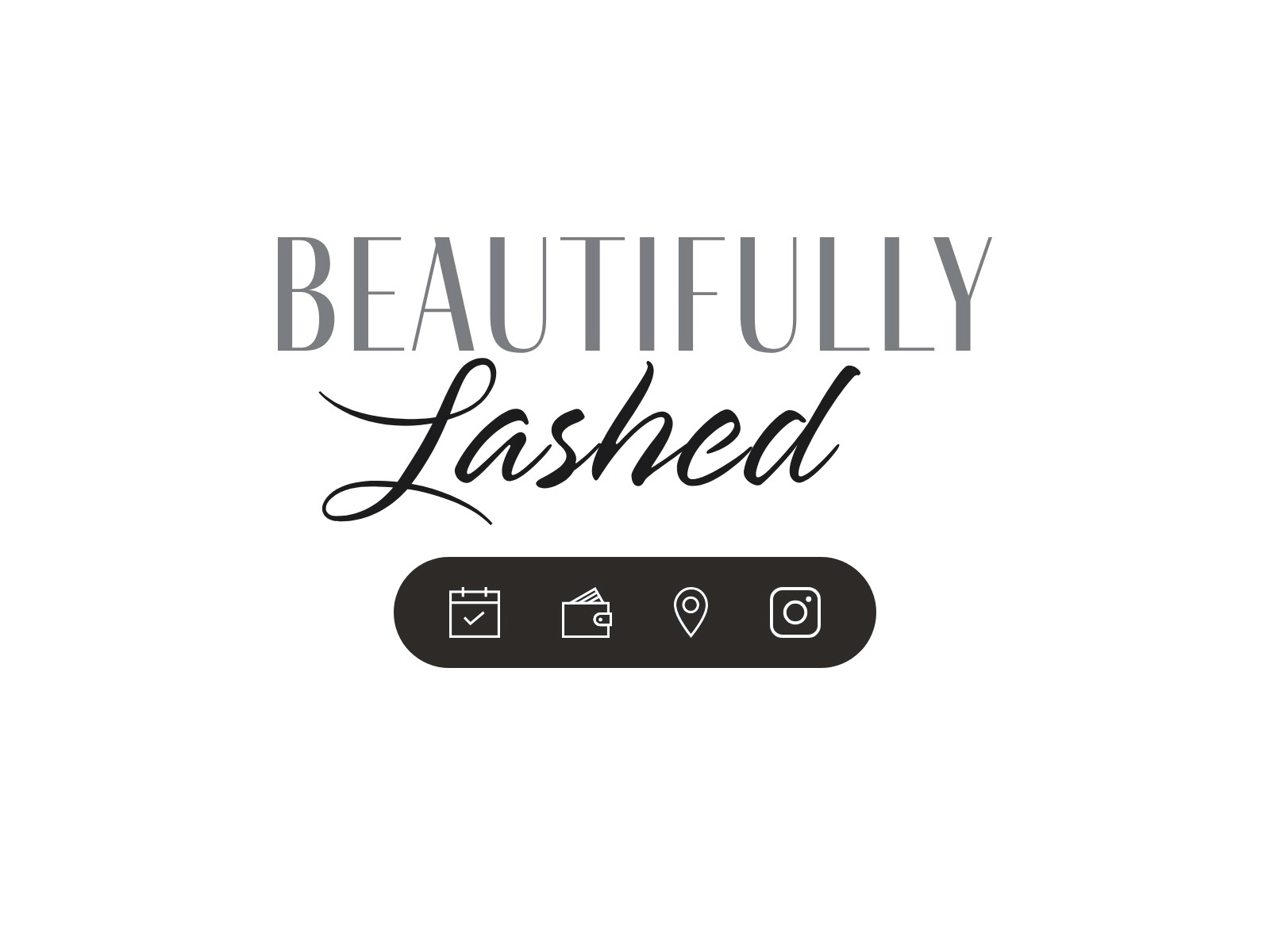
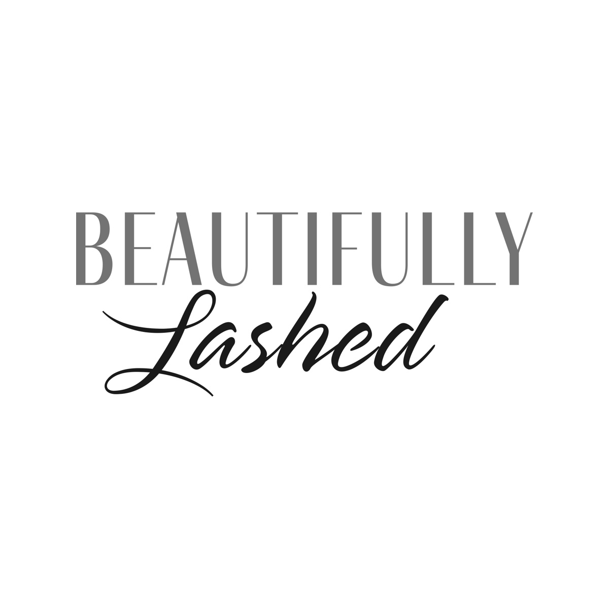
I redesigned the studio's logo. It pairs "BEAUTIFULLY" in tall, thin uppercase serif letters with "Lashed" in a flowing script, in grey and black. The contrast between the two styles reads as elegant and feminine.
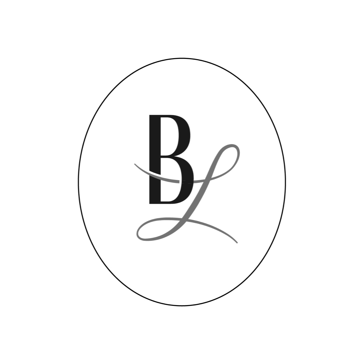
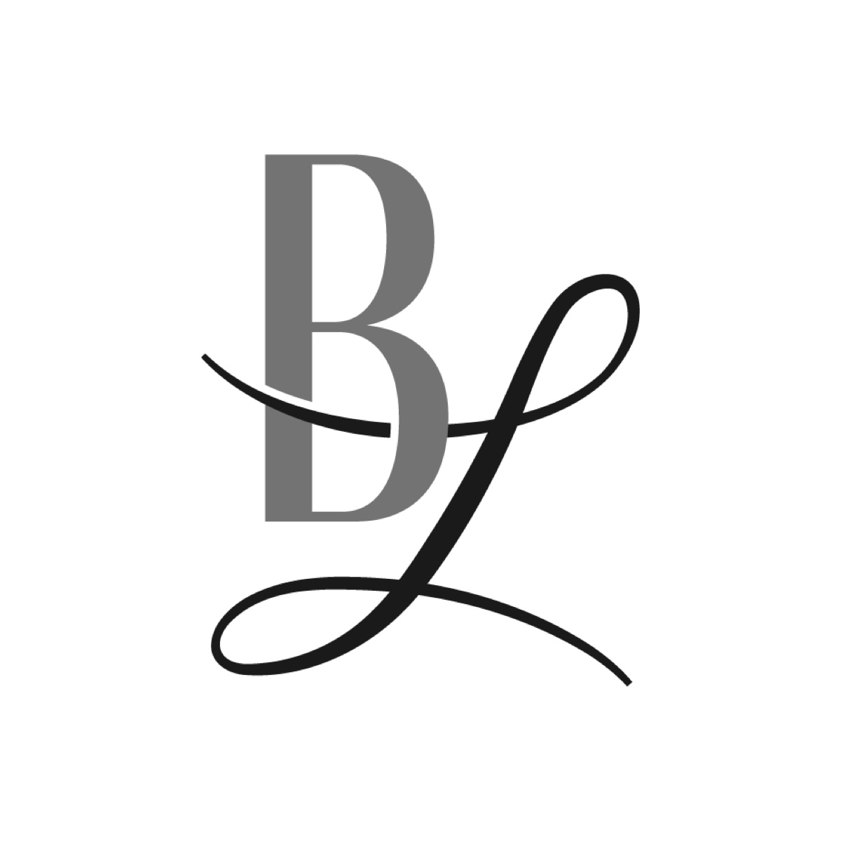
I also made a monogram: a bold serif B with a script L whose loops sweep through it. It comes in two versions, a black B and grey L inside an oval, and a grey B and black L on their own.
There isn't a brand guide for this one, but I worked with her to choose her new brand fonts and colours, soft greys, charcoal and black on off-white, to create an aesthetic she loves.
02 · Icons
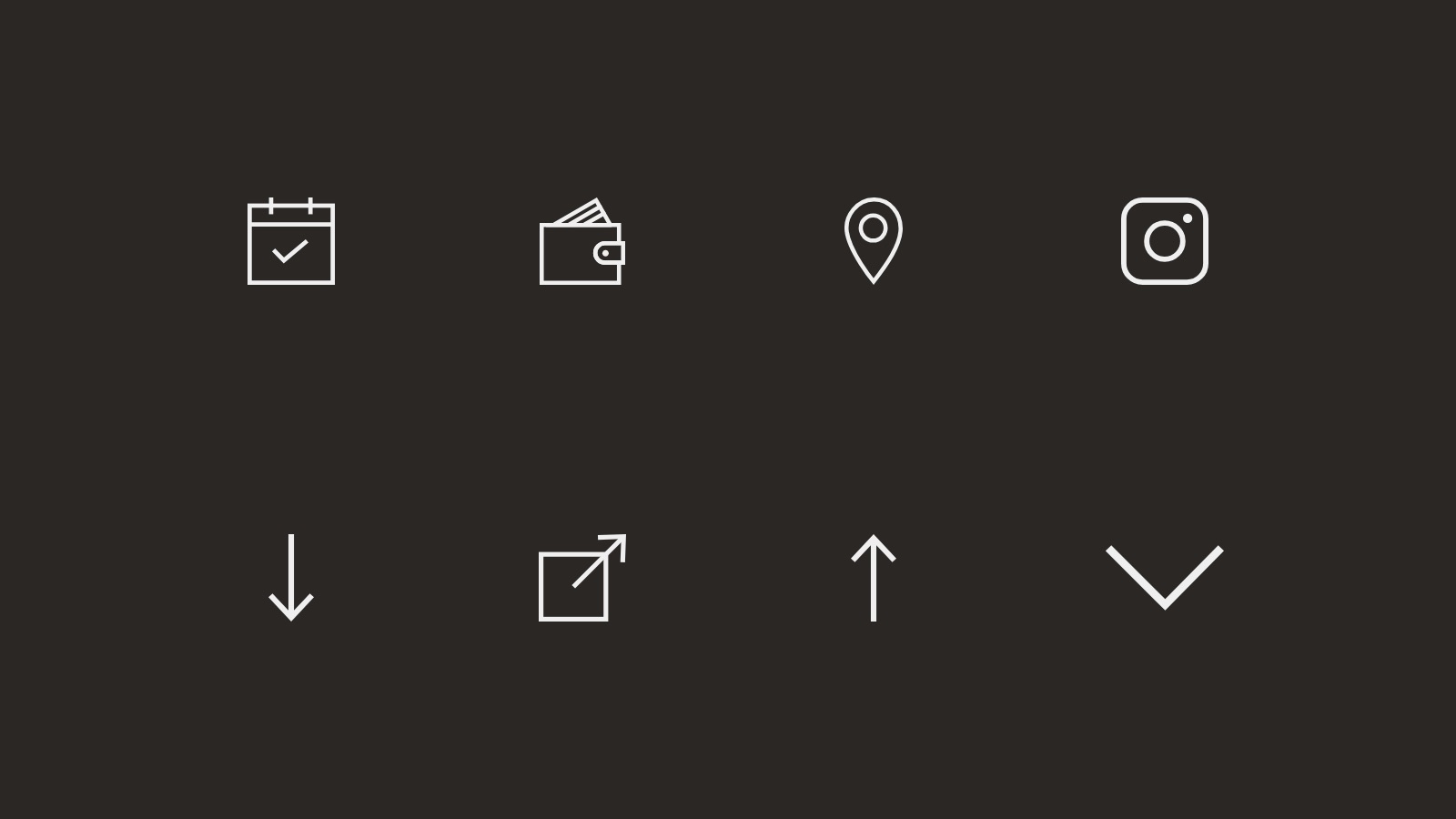
A custom set of simple line icons guides visitors through the site:
- Calendar for booking
- Wallet for pricing and payment
- Location for finding the studio
- Instagram for following the studio's work
- Arrows and a chevron for navigation and back to top
03 · Website
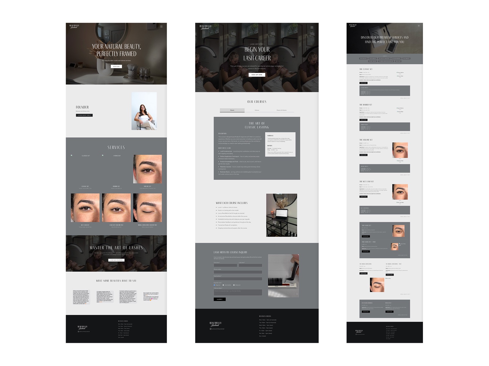
The site uses soft greys, charcoal and off-white with tall, thin serif headings, and studio photos throughout.
- Homepage: a hero that reads "Your natural beauty, perfectly framed", an introduction to the founder, a grid of services, a banner for the academy and client testimonials.
- Academy: the lash artistry courses, with a tab for each course, what each course includes and an inquiry form.
- Services: every lash and brow service with its details, before and after photos and a "Book now" button.
Deliverables
- Logo redesign
- Monogram, in two versions
- Brand fonts and colours
- Website
- Custom icon set