
Ciao
Trattoria Brand & Website
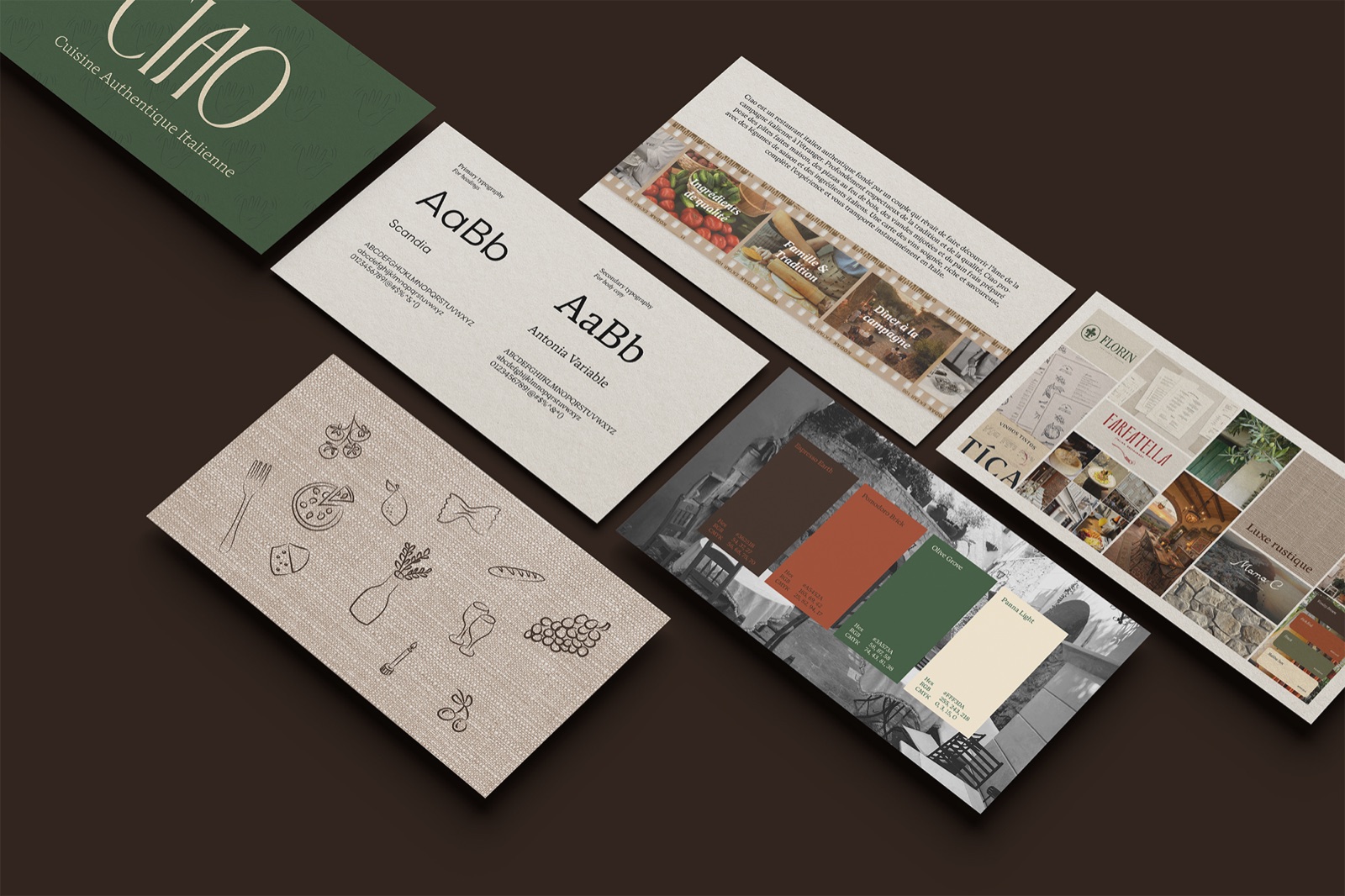
Overview
Ciao is a fictional Italian trattoria in Montréal's Petite-Bourgogne, created as a passion project. I designed all of it: the brand identity, the printed menu, social posts and a five-page bilingual website.
The brief
A self-directed project: build a restaurant brand from strategy to website, and make it feel like a place you'd want to eat at on a Saturday night.
Research
About Ciao
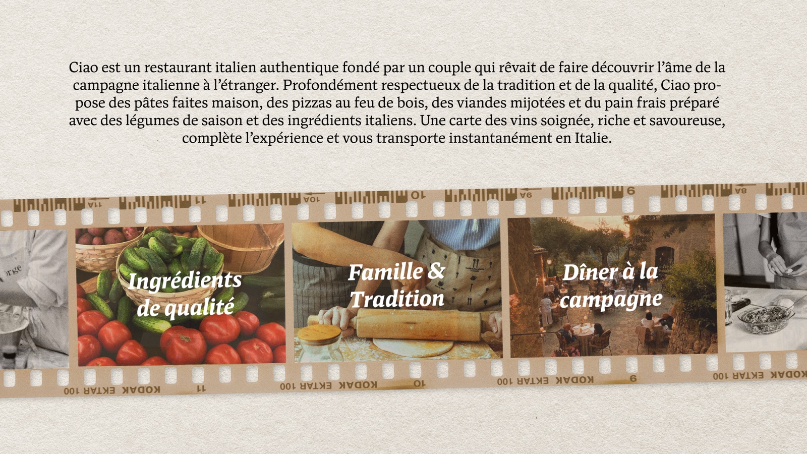
Ciao is an authentic Italian restaurant founded by a couple, Elisabetta and Luca, who dreamed of sharing the soul of the Italian countryside abroad. Deeply respectful of tradition and quality, it serves homemade pasta, wood-fired pizza, slow-cooked meats and fresh bread made with seasonal vegetables and Italian ingredients, with a rich, carefully chosen wine list.
Three pillars: quality ingredients, family and tradition, and countryside dining.
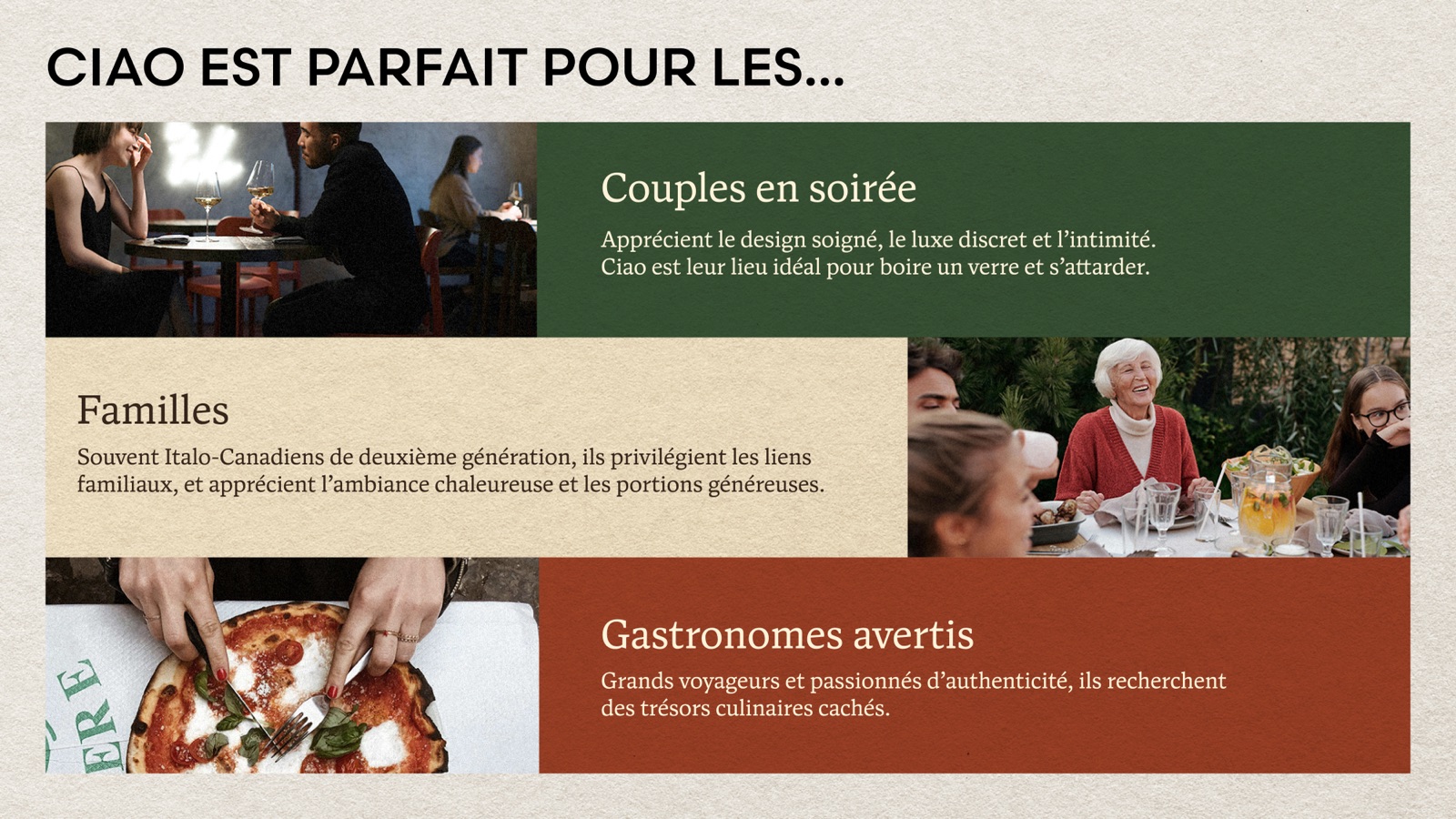
Ciao is perfect for...
- Couples on a night out. They appreciate thoughtful design, quiet luxury and intimacy. Ciao is their place to have a drink and linger.
- Families. Often second-generation Italian-Canadians, they value family ties, a warm atmosphere and generous portions.
- Food lovers. Seasoned travellers who care about authenticity and are always looking for hidden culinary gems.
Process
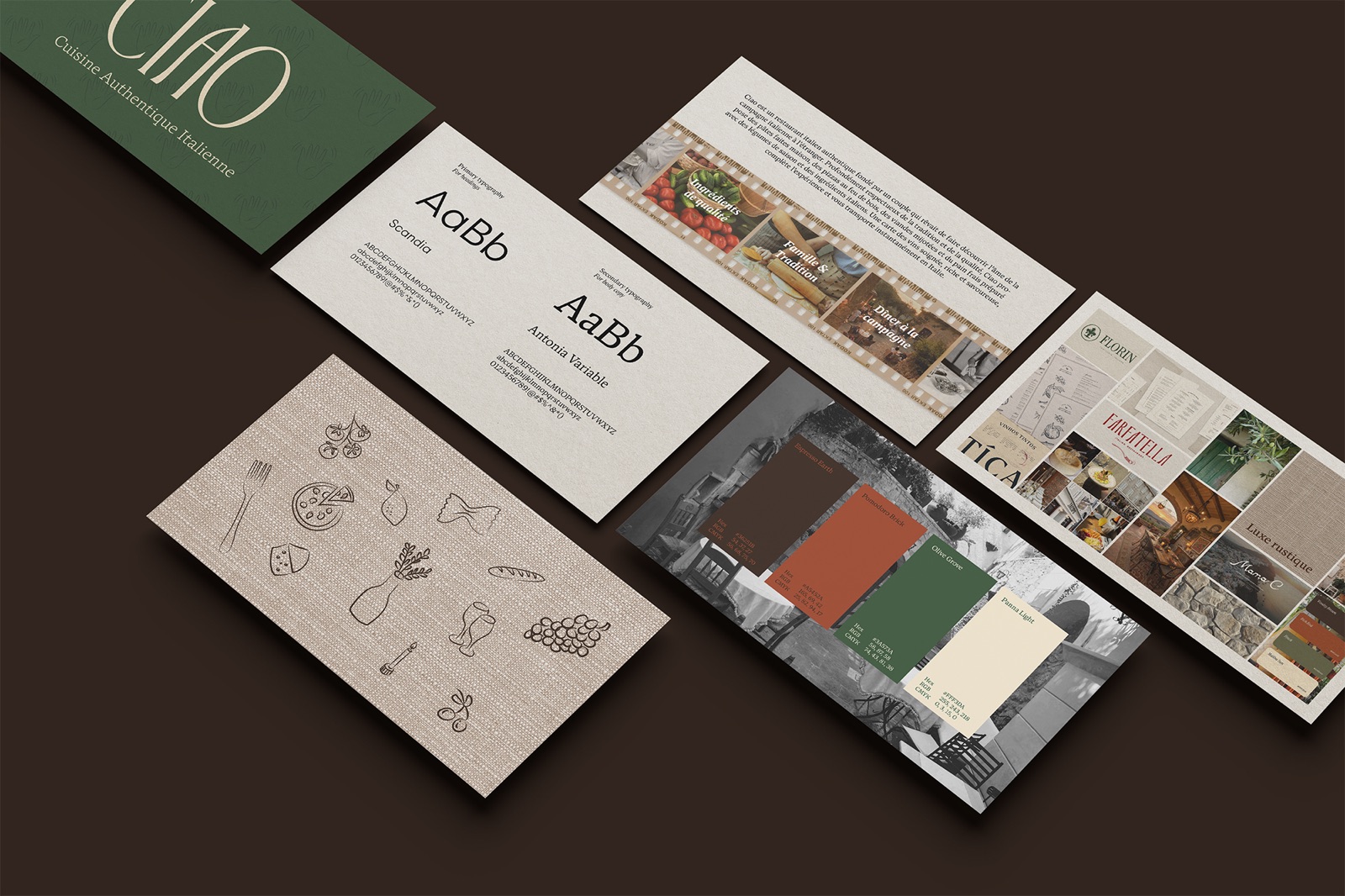
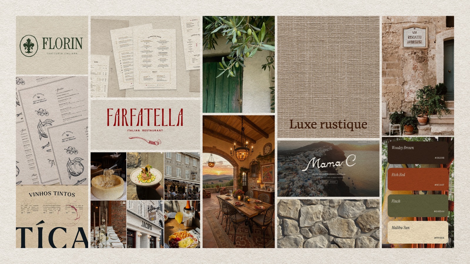
01 · Moodboard: rustic luxury
Trattoria logos and menus with line-drawn botanicals, linen and stone textures, olive branches, a candlelit terrace at sunset and Italian street scenes.
02 · Identity
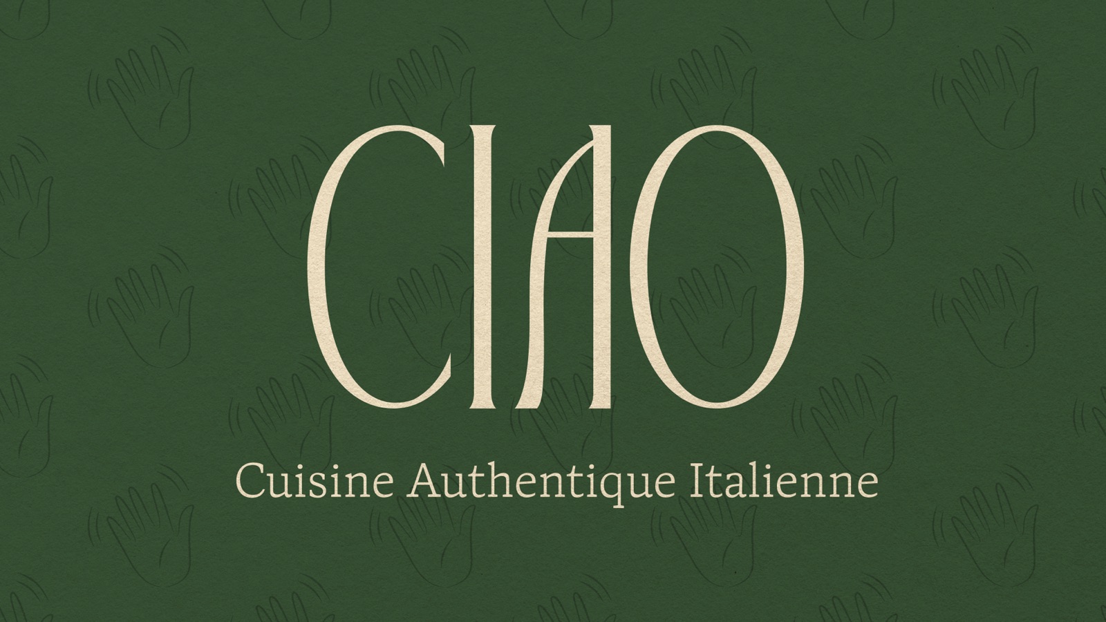
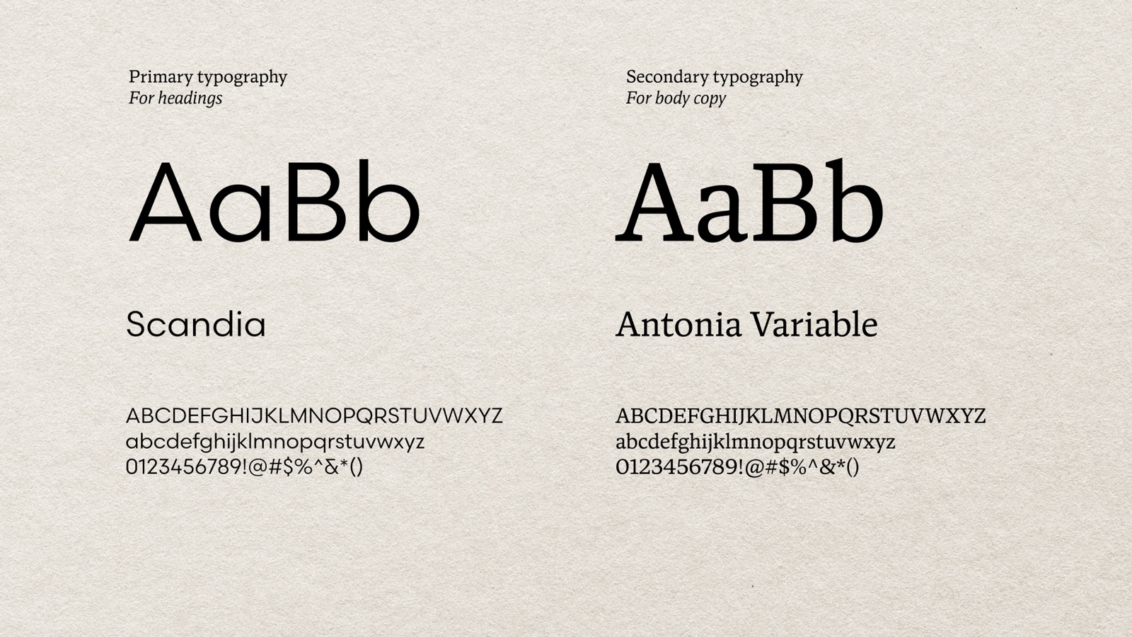
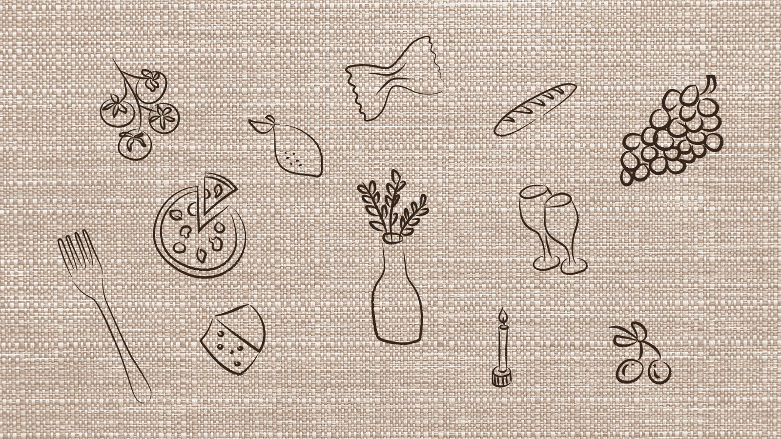
A refined wordmark with the tagline "Cuisine Authentique Italienne", in four colourways. Scandia and Antonia Variable carry the type, and twelve hand-drawn illustrations (pasta, wine glasses, a candle, bread, tomatoes, pizza, grapes, olives, a lemon) add warmth.
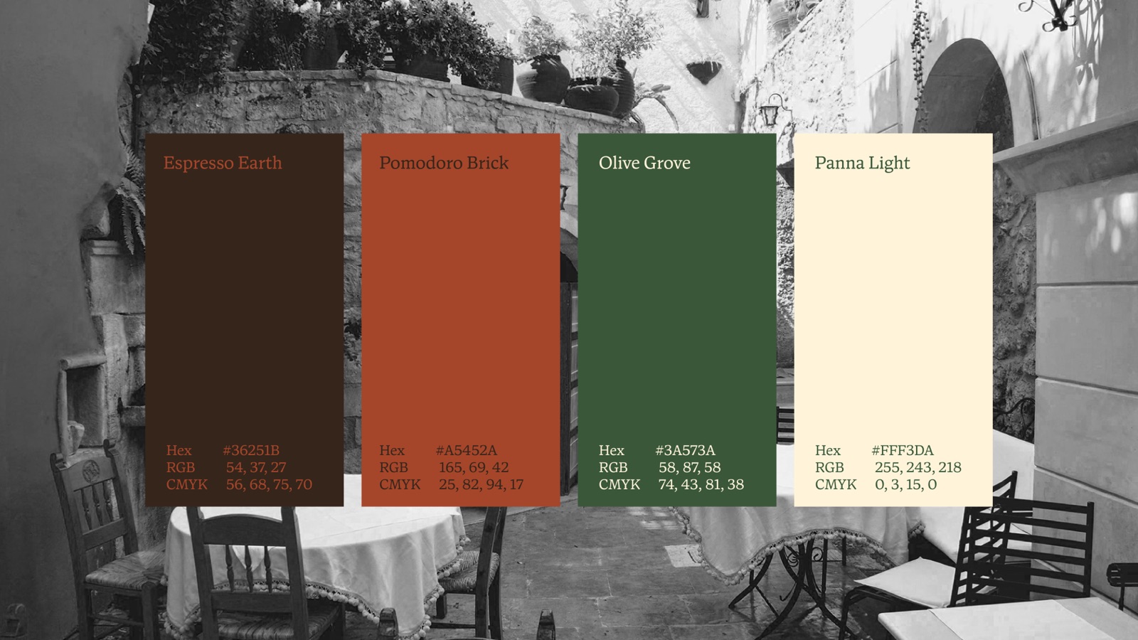
| Colour | Hex | RGB |
|---|---|---|
| Espresso Earth | #36251B | 54, 37, 27 |
| Pomodoro Brick | #A5452A | 165, 69, 42 |
| Olive Grove | #3A573A | 58, 87, 58 |
| Panna Light | #FFF3DA | 255, 243, 218 |
03 · Applications
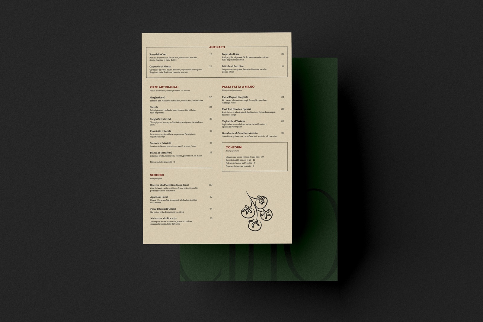
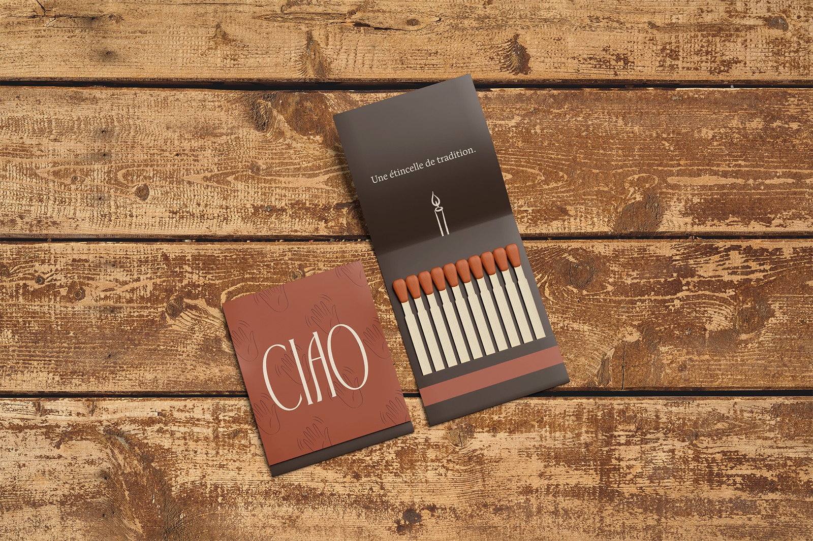
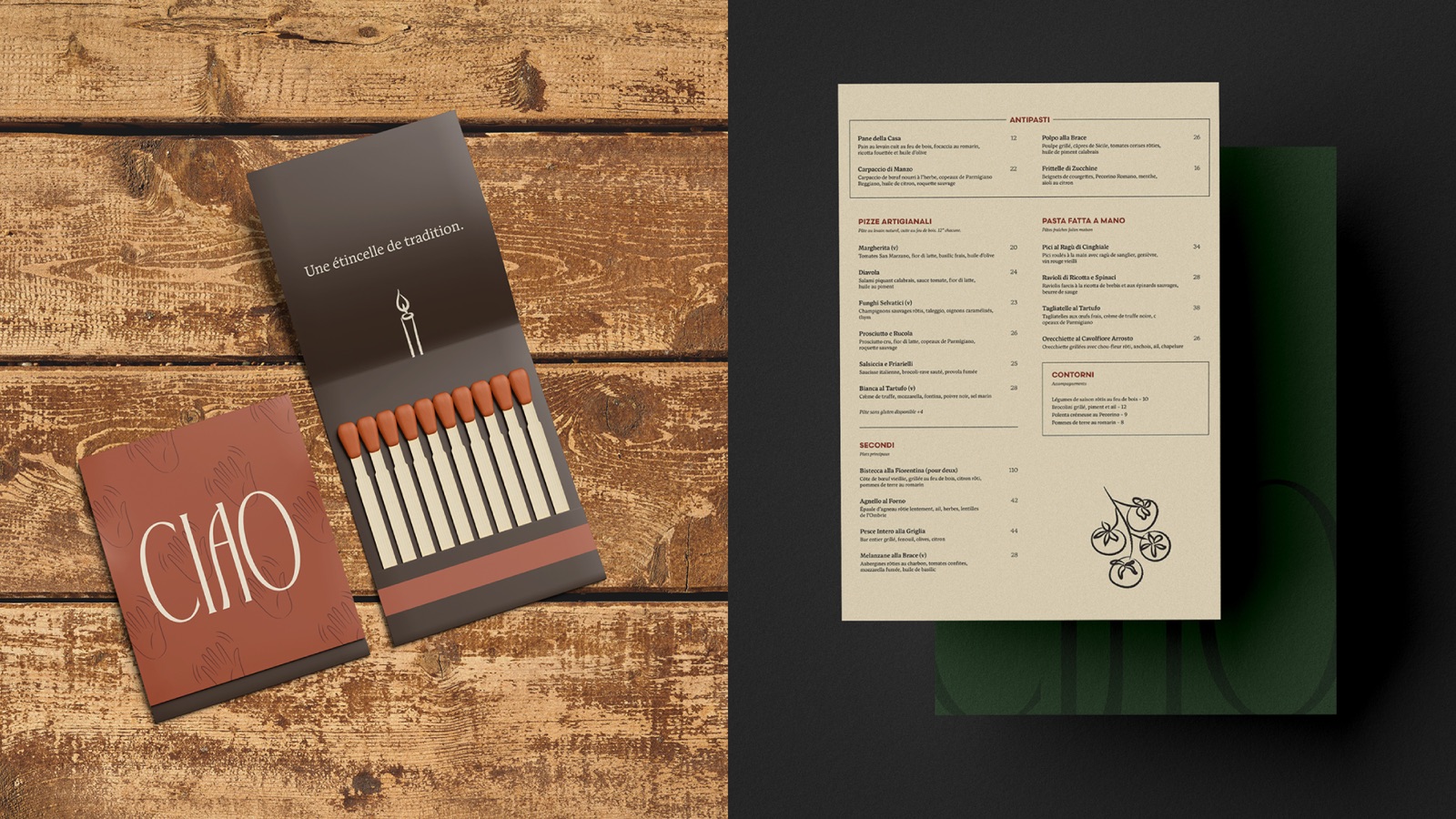
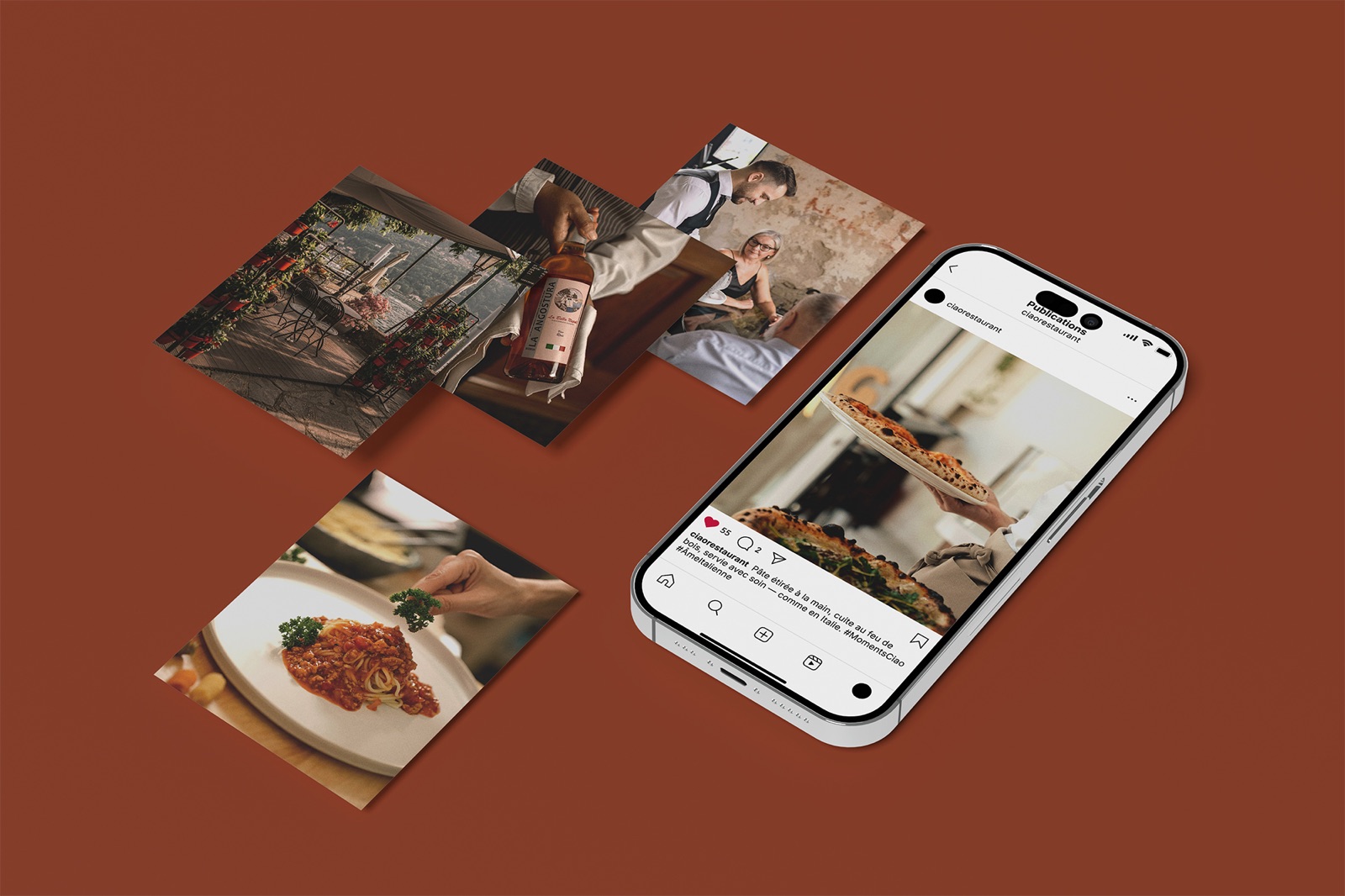
A printed menu, a matchbox, social media posts and a brand presentation.
04 · Website
I designed the site in Framer, then built a five-page bilingual (French and English) version by hand in HTML, CSS and JavaScript: home, the full menu, the couple's story, reservations, and groups and private events.
- A burger menu that opens an olive panel with an animated transition, and an EN | FR switch.
- A booking flow with a waitlist: if a time is full, the guest sees the nearest available times and can ask to be told if their table frees up.
- Every text colour pairing passes WCAG AA contrast.
05 · Beyond the design
Looking back, the site was built for how it looks, not for what happens after someone sees it. Calls during service go unanswered, messages about private bookings wait until the next morning, and guests who loved their night never hear from the restaurant again. My next step would be the systems behind the site: a text back for missed calls, instant alerts when a cancelled table opens up, and a follow-up message after a visit.
Deliverables
- Brand strategy and moodboard
- Logo suite, illustrations, typography and palette
- Printed menu, matchbox, social posts and presentation deck
- Website, designed in Framer and hand-coded
Final work